Perfect background color for product photography is one of the most important factors in creating professional and high-converting product images. The right background color highlights product details, improves brand presentation, and influences customer buying decisions.
At Clipping Area, we work with eCommerce brands and photographers every day to optimize product images for Amazon, Shopify, and online stores. Based on real editing experience, this guide explains how to choose the perfect background color for product photography using color psychology, contrast rules, and marketplace best practices.
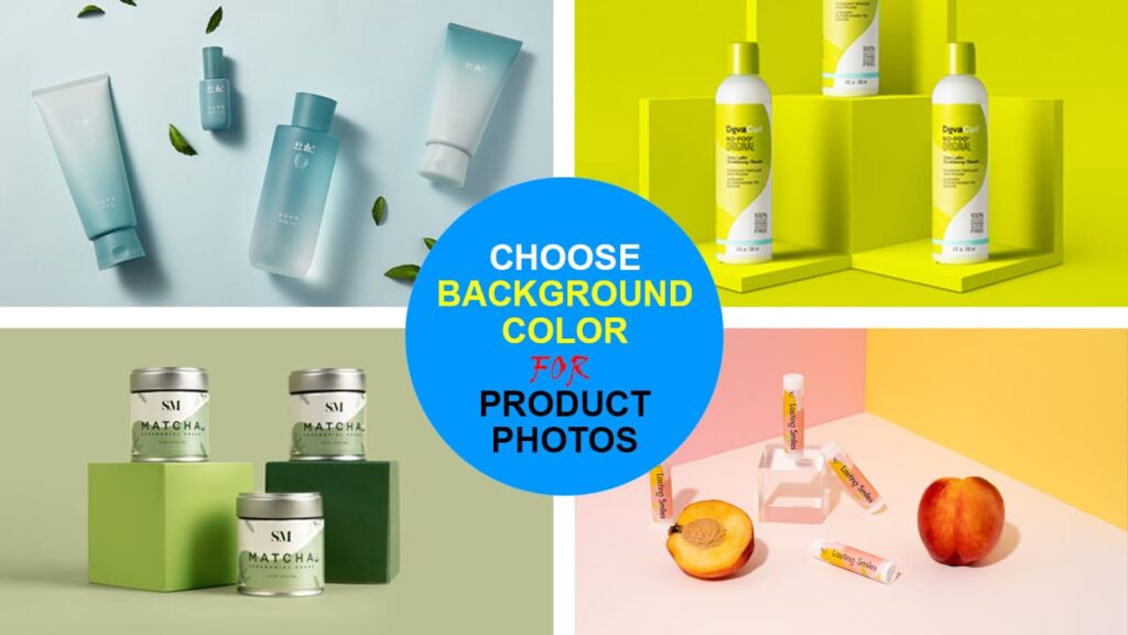
Why Background Color Matters in Product Photography
Background color directly affects how customers see your product. A good background:
-
Makes the product stand out clearly
-
Reduces distractions
-
Enhances texture and shape
-
Builds brand consistency
-
Increases conversion rate
A poor background choice can make products blend into the image or look unprofessional, which lowers trust and sales.

Color Psychology in Product Photography
Different background colors create different emotional responses:
| Color | Effect & Best Use |
|---|---|
| White | Clean, professional (Amazon, catalogs) |
| Black | Luxury, premium (jewelry, watches) |
| Blue | Trust and reliability (electronics, medical) |
| Red | Energy and excitement (fashion, sports) |
| Green | Natural and organic (eco products) |
| Beige / Gray | Neutral and modern (furniture, decor) |
Choosing a background color that matches your brand message improves visual impact.
Best Background Color Based on Product Color
| Product Color | Best Background Choice |
|---|---|
| White or light products | Gray, pastel, soft blue |
| Black or dark products | White, beige |
| Bright or colorful products | Neutral background |
| Transparent products | White or gradient |
| Metallic products | Black or dark neutral |
Strong contrast ensures the product remains clearly visible.
Best Background Color Based on Product Type
| Product Type | Recommended Background |
|---|---|
| Clothing | White, light gray |
| Jewelry | Black, dark gray |
| Furniture | Beige, soft gray |
| Food | Light neutral or warm tones |
| Cosmetics | White or pastel |
| Electronics | White or dark neutral |
Matching background color with product type improves clarity and professionalism.
Best Background Color for Specific Industries
Different industries require different background colors to present products in the most appealing and professional way. Choosing the right background based on industry improves visual clarity and increases buyer trust.
Fashion
For fashion products such as clothing, shoes, and accessories, white and light gray backgrounds work best. These colors keep the focus on fabric texture, stitching, and fit. For lifestyle images, soft pastel or neutral tones can be used to create a stylish and modern look without distracting from the product.
Jewelry
Jewelry products benefit from dark backgrounds such as black, charcoal, or deep gray. These colors create strong contrast and make metallic finishes, gemstones, and reflections stand out. A dark background also adds a luxury and premium feel to the product image.
Furniture
Furniture products look best on beige, cream, or soft gray backgrounds. These tones provide a natural and home-friendly appearance while maintaining a clean and professional look. Neutral backgrounds also help customers visualize furniture in real living spaces.
Food
Food products perform well on light neutral or warm backgrounds such as off-white, light wood tones, or soft pastel shades. These backgrounds enhance color richness and make food appear fresher and more appetizing. Bright white backgrounds may also be used for clean packaging shots.
Electronics
Electronics products work best with white or dark neutral backgrounds. White backgrounds create a clean, technical appearance, while dark gray or black backgrounds add a modern and premium feel. High contrast is essential to clearly show product shape and details.
Lighting and Background Color Relationship
Lighting and background color work together to determine the final appearance of a product image. A poor balance between lighting and background can reduce clarity and distort colors.
Dark backgrounds require stronger and more controlled lighting to prevent the product from blending into the background. Additional light sources are often needed to highlight edges and textures when using black or deep-colored backgrounds.
White backgrounds naturally reflect light and reduce harsh shadows. This makes them ideal for eCommerce product photography because they create a clean and evenly lit look. Proper lighting ensures that the product does not appear washed out against a bright background.
Lighting also affects color tone. Warm lighting can change a background’s appearance to yellow or orange, while cool lighting can create a bluish tone. To maintain accurate product colors, background and lighting temperature must be balanced carefully.
Background Color for Mobile and Social Media
Mobile screens are smaller, so background color plays a bigger role in product visibility. High contrast between the product and background helps the product remain clear even on small displays.
On platforms like Instagram and Facebook, colored or gradient backgrounds can be used to attract attention while scrolling. However, the product must remain clearly separated from the background to avoid visual confusion.
For product thumbnails, simple and neutral backgrounds perform best. Busy or patterned backgrounds reduce clarity and make the product harder to recognize at small sizes. Clean backgrounds improve click-through rates and visual recognition on mobile devices.
Best Background for eCommerce Platforms
Amazon Product Images
-
Pure white (#FFFFFF) background
-
Product fills 85% of the frame
-
No heavy shadows touching edges
Shopify & Brand Stores
-
White or light neutral for main images
-
Brand colors for lifestyle images
-
Consistent background across catalog
Social Media & Ads
-
Colored or gradient backgrounds
-
High contrast
-
Emotion-based color choice
Benefits of Using Solid Color Backgrounds
Solid backgrounds are widely used in professional product photography because they:
-
Remove distractions
-
Highlight product details
-
Improve consistency
-
Speed up editing
-
Meet marketplace rules
White Background
-
Clean and professional
-
Best for eCommerce
-
Easy to edit
Black Background
-
Adds drama and depth
-
Ideal for luxury products
Factors to Consider When Choosing Background Color
Before selecting a background color, consider:
-
Product color and texture
-
Brand color palette
-
Target audience
-
Platform rules
-
Emotional tone (luxury, clean, natural)
-
Lighting and shadow behavior
Your background should support — not compete with — your product.
Common Background Color Mistakes to Avoid
❌ Using similar color as the product
❌ Patterned or textured backgrounds
❌ Inconsistent backgrounds across products
❌ Ignoring marketplace guidelines
❌ Over-saturated colors
❌ Poor contrast
These mistakes reduce image quality and conversion rate.
How to Test Background Colors Before Finalizing
-
Shoot product on neutral background
-
Replace backgrounds digitally
-
Compare contrast and clarity
-
Check on mobile devices
-
Collect feedback
-
Choose the clearest option
Professional photo editing allows testing different background colors without reshooting.
Create Consistency in Product Photography
Consistency builds brand trust. Maintain:
-
Same background color
-
Same lighting style
-
Same framing
-
Same shadow direction
This is especially important for clothing, cosmetics, and furniture catalogs.
Tips for Selecting the Perfect Background Color for Product Photography
-
Keep backgrounds simple
-
Use neutral colors for flexibility
-
Match background with brand identity
-
Focus on contrast
-
Test before publishing
-
Follow marketplace requirements
Final Thoughts
Choosing the perfect background color for product photography improves visual appeal, strengthens branding, and increases sales potential. The best background color depends on:
-
Your product
-
Your audience
-
Your platform
-
Your brand personality
By applying color psychology, contrast rules, and consistency, you can create professional product images that attract and convert buyers.
Frequently Asked Questions (FAQ)
What is the best background color for product photography?
White is the most popular background because it looks clean and professional and works well on most eCommerce platforms.
Is white background mandatory for product photos?
Amazon requires white backgrounds for main images, but lifestyle and brand photos can use other colors.
Can I use colored backgrounds for product photography?
Yes. Colored backgrounds work well for branding, advertising, and social media if the product remains clearly visible.
Which background color works best for dark products?
White or light gray backgrounds provide the strongest contrast for dark products.
Should all product photos use the same background color?
Yes. Using the same background color improves brand recognition and makes your store look professional.