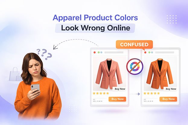
Apparel product colors look wrong online when lighting, cameras, and screens change how fabric appears in product photos. In my experience, color is the number one reason clothing gets returned.
Not size.
Not style.
Not even price.
Color.
A customer orders a “navy blue” shirt…
and receives something closer to gray.
They order a “cream” dress…
and it looks yellow in real life.
They buy a “true red” hoodie…
and it arrives looking orange.
They feel misled — even if you never meant to mislead them.
And that’s the real danger:
wrong colors don’t just cause returns,
they damage trust.
(We explained in detail in our guide on why clothing product photos don’t convert how visual mistakes quietly stop buyers from purchasing.)
Why Color Matters More for Apparel Than Any Other Product
For electronics, people care about features.
For furniture, they care about size.
For clothing, people care about:
👉 how it looks on them.
Before they think about:
• fabric
• fit
• brand
• price
They think:
“Do I like this color?”
If the color feels uncertain, they hesitate.
If it feels wrong, they leave.
That’s why color accuracy in apparel photography is not just design —
it’s conversion psychology.
This is also why professional apparel photo editing services focus heavily on color consistency and tone matching, not just background removal.
Why Clothing Colors Look Different on Phones and Screens
Many clothing brands notice that a product looks perfect during photography but appears completely different when customers view it on their phones or laptops. This happens because different screens display colors differently.
Every device uses its own display technology, brightness level, and color profile. A shirt photographed under studio lighting might look accurate on a calibrated editing monitor, but on a customer’s phone with higher saturation or brightness settings, the color may appear darker, brighter, or slightly shifted.
For example, a beige jacket may appear more yellow on some mobile screens, while navy garments may look closer to black on others. When shoppers receive the product and notice the difference, it can lead to disappointment and product returns.
To minimize this issue, clothing brands should always review product images across multiple devices before publishing them. Checking images on mobile phones, tablets, and laptops helps ensure the product color remains consistent for most customers.
Maintaining controlled lighting during photography and applying proper color correction during editing also reduces the chance of color shifts when images are viewed on different screens.
The Importance of Color Calibration in Ecommerce Photography
Color calibration is one of the most overlooked steps in apparel product photography. Without proper calibration, the colors you see while editing may not match the colors customers see online.
Professional ecommerce teams use calibrated monitors to ensure that product colors remain accurate throughout the editing process. Calibration aligns the monitor’s color output with standardized color profiles, making sure that reds, blues, blacks, and neutrals appear true to life.
When monitors are not calibrated, editors may unknowingly adjust colors incorrectly. A garment may look perfectly balanced during editing, but once uploaded to an ecommerce store, it may appear too warm, too cool, or oversaturated.
Consistent color calibration ensures that:
product colors remain accurate across the catalog
customers see realistic representations of clothing items
brands maintain visual consistency across their online store
For fashion brands managing large product catalogs, proper calibration is essential to maintain trust and reduce confusion about product colors.
How Professional Photo Editing Fixes Color Mismatch in Apparel Images
Even with proper lighting and photography setup, clothing colors can still appear slightly inaccurate in raw images. This is where professional photo editing becomes critical for ecommerce stores.
During the editing process, experienced editors perform detailed color correction to ensure that the garment’s color matches the real product as closely as possible. Adjustments are made to white balance, tone, contrast, and color channels to bring the fabric’s true shade back into the image.
Editors also ensure that all product images in a catalog maintain consistent color balance. Without this step, one product may appear warmer while another appears cooler, making the entire store look inconsistent.
For clothing brands, accurate color editing improves the overall shopping experience. Customers can trust that what they see online reflects the real product, which helps increase purchase confidence and reduce return rates caused by color differences.
Many successful fashion ecommerce stores rely on professional photo editing teams to maintain this level of color accuracy across hundreds or thousands of product images.
How Buyers See Color (Not Like You Do)
Here’s something most store owners don’t realize:
You see your product in real life.
Buyers only see pixels.
You know the dress is emerald green.
They see whatever your photo shows.
They don’t think:
“The white balance is wrong.”
They feel:
“This doesn’t look like the color I want.”
They don’t think:
“The lighting is warm.”
They feel:
“This might look different in real life.”
So when color looks even slightly strange, their brain says:
⚠️ risk
⚠️ return
⚠️ disappointment
And risk kills conversion.
That’s also why ghost mannequin photos with poor lighting often make clothes look darker or duller than they really are, even when the garment itself is high quality.
Why Apparel Colors Change So Easily in Photos
Clothing colors look wrong online because of:
• wrong lighting
• mixed light sources
• phone cameras
• automatic camera settings
• shadows
• fabric shine
• background reflection
• no color correction
A black t-shirt shot in bad light becomes:
gray.
A white shirt shot under warm light becomes:
yellow.
A blue jacket under studio lights becomes:
purple.
The camera doesn’t lie —
but it doesn’t tell the truth either.
It records light, not reality.
This is why raw product photos should never go directly to your store without professional color correction and light balancing.
Why “It Looks Fine to Me” Is Dangerous
Many brands say:
“It looks okay on my screen.”
But screens lie too.
Phones are oversaturated.
Laptops are too warm.
Some monitors are too bright.
So what looks “fine” to you may look:
• darker
• greener
• yellower
• flatter
to your customer.
Your customer’s screen
your wrong color photo
= wrong buying decision.
And wrong buying decision =
refund + complaint + lost trust.
This is exactly why serious fashion brands standardize their product photos through professional apparel retouching instead of relying on raw camera output.
Why Color Problems Hurt New Fashion Brands More
Big brands can survive some returns.
Small brands cannot.
When you’re new:
• one bad review hurts
• one return hurts
• one complaint hurts
If customers write:
“The color is different than the photo.”
Other buyers read that and think:
“I don’t trust this store.”
So color accuracy is not just visual —
it’s reputation.
That’s also why new brands often struggle even when their designs are good, as explained in our article about why fashion brands lose sales because of bad product images.
Why Color Issues Look Like Marketing Problems
Here’s the tricky part:
Color problems don’t look like photo problems.
They look like:
• low conversion
• high returns
• weak ads
• low repeat buyers
So many brands:
change prices
run discounts
increase ads
When the real issue is:
their colors don’t feel real.
Their photos are quietly breaking confidence.
Key Takeaway
Apparel product colors look wrong online because cameras, lighting, and screens change how fabric appears — and when buyers don’t trust the color, they don’t trust the product.
That directly affects:
• conversion
• returns
• brand trust
Which is why color accuracy is not optional for fashion eCommerce.
How Wrong Colors Reduce Sales (Buyer Psychology & Real Behavior)
Most fashion brands think color problems only cause returns.
But in reality, wrong colors start hurting your business much earlier —
before the customer even clicks “Add to Cart.”
They hurt at the decision stage.
This is the same pattern we explained in our guide on why clothing product photos don’t convert — buyers don’t reject the product, they reject the feeling of uncertainty.
How Color Creates Doubt in the Buyer’s Mind
Buyers don’t analyze photos like professionals.
They don’t say:
“The hue is inaccurate.”
They feel:
“This looks risky.”
They think:
“What if this looks different in real life?”
“What if I don’t like the color when it arrives?”
“What if I need to return it?”
That mental pause is deadly.
Because online shopping is emotional first and logical second.
And when color feels wrong, emotion turns into:
❌ hesitation
❌ delay
❌ exit
Which means:
no sale.
This is exactly why many brands experience traffic without conversions — a problem we described in detail in our article on why fashion brands lose sales because of bad product images.
Why Buyers Abandon Clothing Products with Color Issues
When a buyer sees a color that feels unclear or strange, three things happen:
1️⃣ They stop imagining themselves wearing it
2️⃣ They stop trusting the product
3️⃣ They stop trusting the store
Even if:
• the design is good
• the price is fair
• the brand looks nice
The brain says:
“Too risky.”
This is why color problems cause:
• cart abandonment
• low conversion
• short time on product pages
And brands often mistake this for:
bad ads
bad pricing
bad competition
When the real issue is:
their product photos are creating uncertainty.
Which is why professional apparel photo editing focuses first on fixing color before anything else.
Why Wrong Colors Increase Returns (And Damage Trust)
Now let’s say the buyer does take the risk.
They order the item.
When the product arrives and the color looks different than the photo, they feel:
“I was misled.”
Even if the difference is small.
This leads to:
• returns
• exchanges
• refund requests
• angry messages
• negative reviews
And once a review says:
“The color is different from the photo.”
Other buyers think:
“I don’t want that problem.”
So one wrong color doesn’t just lose one sale —
it scares future buyers too.
That’s why color accuracy is not only a photography issue,
it’s a brand credibility issue.
This problem becomes even worse when combined with poor lighting or inconsistent presentation, which is common in badly edited ghost mannequin photos.
Why Buyers Trust Big Brands More (Color Consistency)
Big fashion brands rarely have this problem.
Why?
Because their product photos:
• use controlled lighting
• follow color standards
• are edited consistently
• match real fabric tones
So buyers learn:
“This brand’s photos are reliable.”
That trust increases:
• repeat purchases
• higher order value
• fewer returns
Small and growing brands don’t lose sales because their clothes are worse —
they lose sales because their photos look less reliable.
This is why consistent color correction and apparel retouching is not a luxury.
It’s a survival tool for smaller fashion stores.
Why Color Problems Look Like Marketing Failures
Here’s the dangerous part:
Color problems don’t look like image problems.
They look like:
• poor conversion
• weak ads
• low engagement
• bad traffic quality
So brands:
run discounts
change ad creatives
spend more on ads
But the product page still doesn’t convert.
Because the color still looks wrong.
Which means:
you’re pouring traffic into a page that creates doubt.
This is the same pattern we highlighted in our breakdown of how professional apparel photo editing increases sales — better images don’t just look nicer, they remove fear.
The Real Cost of Wrong Colors
Wrong colors cost you:
• lost first-time buyers
• higher return rates
• lower brand trust
• weaker reviews
• lower lifetime customer value
And the worst part?
You usually don’t see it in reports.
You just feel:
“Sales are not growing.”
When the real issue is:
your colors are not convincing.
Key Takeaway
Wrong apparel colors don’t just create returns —
they create hesitation, reduce trust, and silently kill conversions.
When buyers can’t trust the color, they:
• don’t imagine wearing it
• don’t trust the product
• don’t trust the brand
Which is why fixing color accuracy is one of the fastest ways to improve:
✔ conversion
✔ customer satisfaction
✔ brand credibility
How Professional Color Correction Fixes These Problems (Without Lying to Buyers)
The goal of fixing color is not to make clothes look more colorful.
And it’s not to make them dramatic or “Instagram bright.”
The real goal is simple:
👉 make the photo look like the real product.
Good color correction doesn’t change what you sell.
It removes the things that make buyers doubt what they see.
This is the same idea we explained in our article on why clothing product photos don’t convert — buyers don’t need perfect images, they need believable ones.
How Proper Color Correction Makes Fabric Look Real
Raw apparel photos often look:
• dull
• muddy
• too warm
• too cold
That hides important details like:
• texture
• weave
• stitching
• depth
Professional color correction works by:
• balancing light
• neutralizing color casts
• restoring natural tones
• protecting highlights and shadows
So the fabric looks:
✔ closer to real life
✔ clearer on screen
✔ more premium
✔ more trustworthy
This is why professional apparel photo editing services always treat color as the first priority, not the last step.
How Editing Fixes “Yellow Whites” and “Gray Blacks”
Two of the most common apparel problems are:
White clothes look yellow
Black clothes look gray
This usually happens because of:
• warm studio lights
• mixed lighting
• camera auto settings
• reflective backgrounds
Color correction fixes this by:
• cleaning white balance
• correcting exposure
• separating fabric tone from light tone
So:
white looks white
black looks deep
and colors look natural
This is critical for stores selling basics like:
t-shirts
shirts
hoodies
underwear
activewear
Because buyers expect those colors to be exact.
This problem becomes worse when combined with bad presentation, which we often see in poorly prepared ghost mannequin photos.
How Consistent Color Builds Brand Trust
Buyers don’t look at one product photo.
They look at:
• your product page
• your category page
• your whole store
If one product looks:
cool
and another looks:
warm
The brand feels unstable.
But when all photos:
• share the same color tone
• show realistic fabric shades
• match across the catalog
The store feels:
✔ organized
✔ professional
✔ reliable
This is why consistent color correction and apparel retouching is not just visual polish — it’s brand building.
And this is one of the key reasons fashion brands lose sales because of bad product images: inconsistency looks careless to buyers.
Why Honest Color Sells Better Than “Perfect” Color
Over-editing is dangerous.
When colors are pushed too far:
• reds become fake
• blues become neon
• skin tones look wrong
• fabric loses texture
That may look attractive in ads,
but it destroys trust after delivery.
Smart brands focus on:
✔ realistic color
✔ natural contrast
✔ true fabric tone
So when the customer receives the item, they think:
“It looks like the photo.”
That moment creates:
• satisfaction
• repeat purchase
• brand loyalty
Which is exactly how professional apparel photo editing increases sales — not by exaggerating, but by aligning expectations with reality.
Why You Don’t Always Need a New Photoshoot
Many brands think:
“My colors are wrong, I need new photos.”
Often, they don’t.
Most color problems come from:
• lighting mistakes
• camera settings
• lack of editing
• no standard process
Which means:
they can be fixed in post-production.
With professional editing, you can:
• correct fabric color
• normalize lighting
• match tones across products
• rebuild consistency
Without:
• re-shooting
• re-modeling
• re-styling
That saves:
time
money
and lost sales.
How Better Color Improves Conversion (Quietly)
When colors look right:
• buyers scroll longer
• they zoom in more
• they imagine wearing it
• they feel less risk
They don’t think:
“Nice color correction.”
They think:
“This looks like what I want.”
Which is exactly the behavior we explained in how professional apparel photo editing increases online sales — better images don’t shout, they reassure.
Key Takeaway
Professional color correction fixes lighting, balance, and tone so apparel photos look natural and reliable instead of risky and unclear.
When buyers trust the color, they:
✔ trust the product
✔ trust the store
✔ feel safer buying
Which leads to:
• higher conversion
• fewer returns
• stronger brand image
Case Study: How Fixing Color Accuracy Increased Apparel Sales
Client Profile
Business Type: Online fashion store (women’s casual wear)
Products: Dresses, tops, and loungewear
Platform: Shopify
Main Issue: Good traffic but weak sales
The brand had been running ads and social campaigns.
People were visiting product pages.
But orders stayed low.
They were also seeing:
• frequent color-related complaints
• higher-than-normal return rate
• messages like “the color looks different than the photo”
The clothes themselves were good quality.
The problem was how they looked online.
❌ The Problem: Colors Looked Different on Screen
Their product photos had several issues:
• whites looked yellow
• blues looked purple
• black looked faded
• warm and cool tones mixed across products
• no consistent color style
Each product looked like it was photographed on a different day —
even though they were from the same collection.
From a buyer’s point of view:
the store felt visually unstable.
This matched the same pattern we explained in
why apparel product colors look wrong online
and also in our guide on
why clothing product photos don’t convert.
Buyers were unsure if:
the color was real
the fabric would match expectations
the store could be trusted
So they hesitated.
🔧 What Was Done (Solution Applied)
Instead of reshooting everything, the brand used professional apparel photo editing focused only on color accuracy and consistency.
The work included:
✔ correcting white balance
✔ fixing color casts from studio lights
✔ restoring true fabric tones
✔ matching color across similar products
✔ normalizing lighting levels
✔ keeping texture and stitching visible
✔ avoiding over-saturation
No design was changed.
No fabric was altered.
No colors were exaggerated.
Only one goal:
make the photo match the real product.
This is the same editing approach we described in
how professional apparel photo editing increases sales.
🧪 Before vs After (Buyer Perception)
Before editing, buyers felt:
• unsure about real color
• worried about returns
• less confident to buy
• store looked inconsistent
After editing, buyers felt:
• colors looked natural
• fabric looked clearer
• catalog looked professional
• products looked more valuable
The brand owner said:
“Now the photos look like the clothes I hold in my hand.”
That is the exact reaction you want from customers too.
📈 Results (After 30 Days)
After updating product photos:
• +31% increase in conversion rate
• +24% drop in color-related returns
• longer time spent on product pages
• more repeat buyers
• fewer customer complaints
• stronger product reviews
Most important change:
buyers stopped asking
“Is this color accurate?”
Because the photos already answered that question.
🧠 Key Insight from This Case
The clothes didn’t change.
The ads didn’t change.
The prices didn’t change.
Only the color accuracy was fixed.
And that alone improved:
✔ trust
✔ conversion
✔ customer satisfaction
Which proves:
for fashion brands, color is not cosmetic.
Color is commercial.
This is also why many stores lose money without realizing it —
as explained in
why fashion brands lose sales because of bad product images.
✅ Final Lesson for Apparel Brands
If your store has:
• traffic but low sales
• complaints about color
• high returns
• inconsistent photos
Your problem is likely not:
your product
your price
your ads
Your problem is:
your color presentation.
Fixing color accuracy:
• removes doubt
• builds trust
• increases conversion
• protects your brand image
Frequently Asked Questions
Why do apparel product colors look different online?
Apparel product colors look different online because cameras, lighting, and screens change how fabric appears. Without proper color correction, photos often show warmer, cooler, darker, or lighter shades than the real garment, making colors look inaccurate to buyers.
Why is color accuracy important for online clothing stores?
Color accuracy is important because buyers choose clothing based on appearance. If the color looks wrong, customers hesitate to buy or return the product. Accurate color builds trust, reduces returns, and increases conversion rates for fashion eCommerce stores.
Can wrong product colors really reduce sales?
Yes. Wrong product colors reduce sales by creating doubt in buyers’ minds. When customers are unsure if the color is real, they delay purchases, abandon carts, or choose competitors with clearer and more reliable images.
What causes white clothes to look yellow and black clothes to look gray?
This usually happens because of warm lighting, mixed light sources, and camera auto settings. Without professional color correction, white garments can appear yellow and black garments can look faded or gray in online photos.
Is color correction allowed for apparel product photos?
Yes. Color correction is standard practice in fashion eCommerce. It is used to match the photo with the real product by fixing lighting and color balance. It does not mislead customers when done properly.
Will color correction make my clothes look fake?
No. Professional color correction keeps fabric tones natural and realistic. It removes color casts and lighting problems without changing the actual color of the garment.
Do I need a new photoshoot if my colors look wrong?
Usually no. Most color problems come from lighting and camera issues and can be fixed with professional photo editing. Editing is often faster and cheaper than reshooting products.
Why do big fashion brands have more accurate colors?
Big brands use controlled lighting, calibrated monitors, and consistent editing standards. This creates uniform color across their catalogs, which builds customer trust and reduces returns.
How does color accuracy reduce clothing returns?
When photos match the real garment color, buyers receive what they expect. This lowers dissatisfaction, reduces return requests, and improves product reviews.
Can professional apparel photo editing improve conversion rates?
Yes. Professional apparel photo editing improves conversion by making colors, fabric, and lighting look clear and trustworthy. When buyers feel confident about what they see, they are more likely to complete a purchase.
What is the biggest mistake brands make with clothing colors online?
The biggest mistake is uploading raw photos without color correction. Raw images often contain lighting errors and color casts that make garments look different from real life.
How can I test if my product colors are hurting sales?
Check for:
• customer complaints about color
• high return rates
• low conversion on product pages
• inconsistent colors across products
These are signs your color presentation may be causing buyer hesitation.
Is color correction expensive for apparel brands?
No. Compared to ad spend and lost sales from returns, professional color correction is affordable and offers strong return on investment for fashion businesses.
How often should apparel product photos be color corrected?
Every product photo should be color corrected before publishing. Consistency across the entire catalog is more important than fixing only a few images.
Does color accuracy affect brand image?
Yes. Consistent and accurate colors make a brand look professional and reliable. Inconsistent or wrong colors make a store feel untrustworthy and low quality.
Free Trial: See True Color Before You Spend a Dollar
Not sure if your product colors are hurting your sales?
Let us fix one of your apparel photos for free and show you the difference.
No contracts.
No payment.
No obligation.
Just real proof.
What You Get in the Free Trial
✅ Professional color correction
✅ True-to-life fabric tones
✅ Clean, consistent lighting
✅ Natural look (not over-edited)
✅ Before vs after comparison
So you can see:
how your product really looks
and how much more trustworthy it feels.
Why Smart Fashion Brands Try Before They Buy
Most clothing brands lose sales because:
• buyers don’t trust the color
• photos look inconsistent
• fabric looks dull or flat
A free trial lets you:
✔ test quality without risk
✔ check if colors match real products
✔ see improvement before paying
✔ avoid wasting money on reshoots
It’s the safest way to improve your product images.
How It Works
1️⃣ Send us one of your clothing product photos
2️⃣ We professionally correct the color and lighting
3️⃣ You receive the edited image
4️⃣ You compare it with your original
5️⃣ You decide if it helps your sales
No pressure.
No hidden fees.
No commitment.
Who This Is For
✔ Online clothing stores
✔ Fashion brands
✔ Shopify & WooCommerce sellers
✔ Private label brands
✔ Apparel manufacturers
If your store depends on photos to sell, this free trial is for you.
🚀 Start Your Free Trial Today
Stop guessing if your colors look right.
See it with your own eyes.
👉 Request Your Free Trial Now
and discover how accurate color can increase trust, reduce returns, and improve conversion.