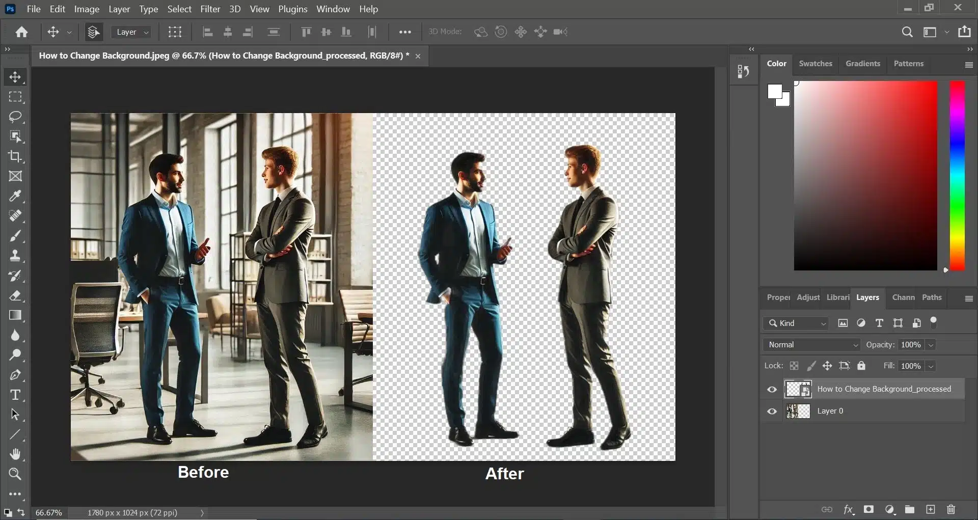
Changing a background color in Photoshop is one of the most essential and widely used photo editing skills in modern digital workflows. From eCommerce product images and professional portraits to furniture photography and marketing visuals, background color editing plays a crucial role in how an image is perceived, trusted, and converted.
At its core, changing a background color in Photoshop means separating the subject from its original background and placing it onto a new color while maintaining realism. This involves more than just selecting and filling a color—it requires accurate selection, clean edges, natural blending, and proper color harmony.
When done correctly, the final image looks natural and professionally shot. When done poorly, it immediately looks fake.
Quick Answer (Featured Snippet–Ready)
To change a background color in Photoshop, select the subject using tools like Quick Selection or the Pen Tool, apply a layer mask, add a solid color fill layer beneath the subject, and refine edges and colors to achieve a natural look.
This non-destructive approach ensures flexibility, accuracy, and professional results.
What Does “Changing Background Color” Really Mean?
Many beginners think background color change is simply “removing the background and adding a new color.” In reality, professionals treat it as a visual reconstruction process.
A proper background color change includes:
Accurate subject isolation
Smooth edge transitions
Matching brightness and contrast
Preserving natural shadows
Maintaining correct color temperature
Without these steps, even a technically correct selection will look unrealistic.
Why Background Color Matters So Much
Background color directly influences how viewers interpret an image—often subconsciously.
Key Reasons Background Color Is Critical
It controls visual focus
It affects brand consistency
It impacts trust and professionalism
It determines marketplace approval
It influences click-through and conversion rates
For example:
White or light gray backgrounds are trusted for eCommerce
Neutral tones work best for corporate portraits
Soft colors enhance furniture textures
Bold colors attract attention in ads
This is why professional image editing workflows always treat background color as a strategic decision, not a cosmetic one.
Who Needs to Change Background Color in Photoshop?
This skill is essential for:
eCommerce sellers (Amazon, Shopify, Etsy)
Photographers (product, portrait, real estate)
Designers & marketers
Fashion and apparel businesses
Advertising agencies
In many industries, poor background quality alone is enough to reduce sales—even if the product itself is excellent.
Photoshop vs Other Tools (Why Photoshop Still Leads)
While AI tools and online background changers exist, Photoshop remains the industry standard because it offers:
Full control over edges and masking
Non-destructive editing with layer masks
Advanced color correction tools
Manual shadow and reflection creation
High-resolution, print-ready output
AI tools are fast, but they struggle with:
Hair and fur
Transparent objects
Fine edges
Realistic shadows
For professional and commercial work, Photoshop delivers unmatched accuracy.
What Makes a Background Color Change Look Professional?
A professional background color change has these characteristics:
No jagged or harsh edges
No white or dark halos around the subject
Natural shadows and grounding
Correct color balance between subject and background
No loss of texture or detail
If any of these elements are missing, the edit looks artificial.
Common Beginner Misconception
One of the biggest mistakes beginners make is focusing only on selection tools.
In reality:
Selection is only 40% of the work
Mask refinement is 30%
Color, shadow, and blending are the remaining 30%
Professional results come from combining all three stages carefully.
What You Will Learn in This Complete Guide
This guide is structured to take you from beginner to professional level. In the upcoming parts, you’ll learn:
Multiple ways to change background color in Photoshop
Which method works best for different image types
Advanced techniques professionals use
How to avoid common mistakes
How to achieve realistic, commercial-ready results
Each part builds on the previous one, so even beginners can follow along confidently.
When and Why You Should Change Background Color in Photoshop (Strategy & Use Cases)
Changing a background color in Photoshop is not only about making an image look clean—it’s about communicating the right message to the viewer. The background color you choose can influence perception, trust, and even buying decisions.
Professionals don’t change background colors randomly. They do it strategically, based on purpose, platform, and audience.
When Should You Change a Background Color?
Not every image needs a background color change. Knowing when to apply it is just as important as knowing how.
You should change background color when:
The original background is distracting
The background color clashes with the subject
The image doesn’t meet marketplace requirements
You need visual consistency across multiple images
You want to align visuals with brand identity
A well-chosen background simplifies the image and improves clarity.
Why Background Color Has a Psychological Impact
Background color affects viewers on a subconscious level. Different colors trigger different emotions, which is why color choice is critical in commercial images.
Common Background Color Effects:
White: Clean, professional, trustworthy
Gray: Neutral, modern, balanced
Blue: Calm, reliable, corporate
Beige: Warm, natural, lifestyle-oriented
Bold colors: Attention-grabbing, promotional
For example:
eCommerce platforms favor white backgrounds
Corporate headshots look best on neutral tones
Ads perform better with high-contrast backgrounds
Professional editors consider these psychological effects before selecting a background color.
Why Businesses Rely on Background Color Editing
Background color consistency builds brand trust. When customers see uniform images across a website or catalog, they perceive the brand as more professional and reliable.
Business Benefits:
Higher product clarity
Improved brand recognition
Increased conversion rates
Stronger visual storytelling
This is why background color editing is a standard part of professional image editing services.
Platform-Specific Background Color Requirements
Different platforms have different expectations—and sometimes strict rules.
eCommerce Marketplaces:
Amazon prefers white backgrounds
Shopify allows flexibility but favors consistency
Etsy encourages clean, neutral backgrounds
Corporate & Professional Use:
Neutral or muted colors
Minimal distractions
Consistent across teams or departments
Advertising & Social Media:
Creative colors allowed
Strong contrast improves engagement
Brand colors perform better
Understanding platform expectations prevents image rejection and improves performance.
When Not to Change the Background Color
There are cases where changing the background color can actually harm the image.
Avoid background color change when:
The original background supports the story
Environmental context is important
Natural lighting cannot be replicated
The subject blends poorly with flat colors
In lifestyle photography, keeping the original background often preserves authenticity.
How Professionals Decide the Right Background Color
Professionals follow a simple decision process:
Identify the image purpose
Consider platform guidelines
Analyze subject color and texture
Choose a background that enhances contrast
Test for realism and balance
The goal is never to overpower the subject, but to support it visually.
Background Color Change vs Background Removal
Many people confuse these two concepts.
Background removal focuses on isolating the subject
Background color change focuses on visual harmony
Removal is just one step. Color change completes the image.
Professional results require both.
Real-World Example Scenarios
A product photo with a cluttered background loses buyer trust
A portrait with a bright background distracts from the face
Furniture images without neutral backgrounds look unrealistic
Ads with low contrast fail to attract attention
In all these cases, background color change improves clarity and impact.
What You Need Before Changing Background Color in Photoshop (Tools, Setup & Preparation)
Before you change a background color in Photoshop, preparation is critical. Most poor-quality background edits don’t fail because of bad tools—they fail because of poor setup and rushed preparation.
Professional editors spend time preparing the image before making any selections. This step alone can dramatically improve edge quality, realism, and overall results.
Why Preparation Matters More Than Tools
Many beginners jump straight into selecting the subject. Professionals don’t.
Proper preparation helps you:
Create cleaner selections
Reduce jagged edges and halos
Preserve fine details (hair, texture, fabric)
Save time during masking and refinement
In short, preparation determines whether your final image looks amateur or professional.
Essential Requirements Before You Start
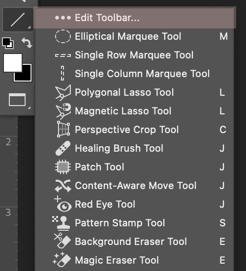
1️⃣ Adobe Photoshop (Version Matters Less Than Skill)
Any modern version of Photoshop works well for background color changes. Tools like:
Select Subject
Select and Mask
Layer Masks
are available in most recent versions.
What matters more is understanding how and when to use them.
2️⃣ High-Quality Image (Very Important)
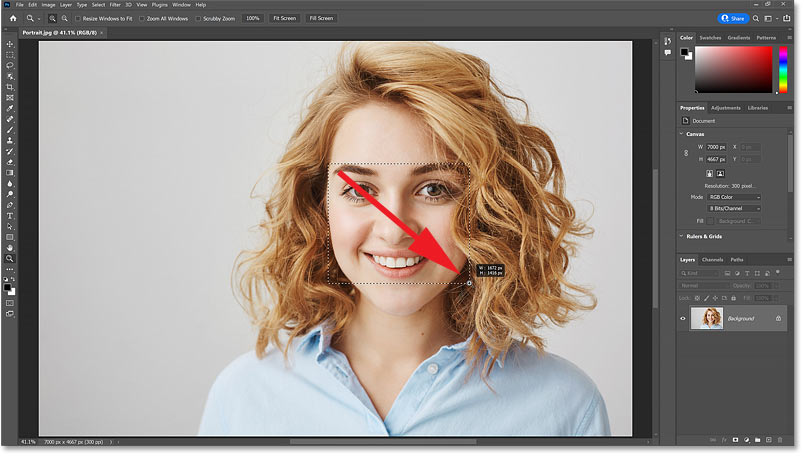
Image quality directly affects selection accuracy.
Best Practices:
Use high-resolution images whenever possible
Avoid heavily compressed or blurry photos
Clear lighting helps define edges
⚠️ Important:
No Photoshop technique can fully fix poor image quality. Clean input = clean output.
3️⃣ Clean and Organized Photoshop Workspace
Before editing:
Open the Layers panel
Ensure the Properties panel is visible
Keep History panel accessible
Professional editors always work in an organized workspace to avoid mistakes.
Photoshop Tools You Must Understand Before Changing Background Color
🔹 Selection Tools (Core Tools)

You don’t need to master every tool—only the right ones.
Most Important Selection Tools:
Quick Selection Tool – Fast, beginner-friendly
Select Subject – AI-powered, time-saving
Pen Tool – Maximum accuracy for products and furniture
Each tool serves a different purpose. Choosing the right one saves hours.
🔹 Layer Masks (Non-Destructive Editing)
Layer masks are essential for professional background color changes.
They allow you to:
Hide or reveal areas without deleting pixels
Fix mistakes anytime
Refine edges gradually
Professional rule:
Never erase backgrounds. Always use layer masks.
🔹 Adjustment & Fill Layers

For background color change, you’ll mainly use:
Solid Color Fill Layers
Curves
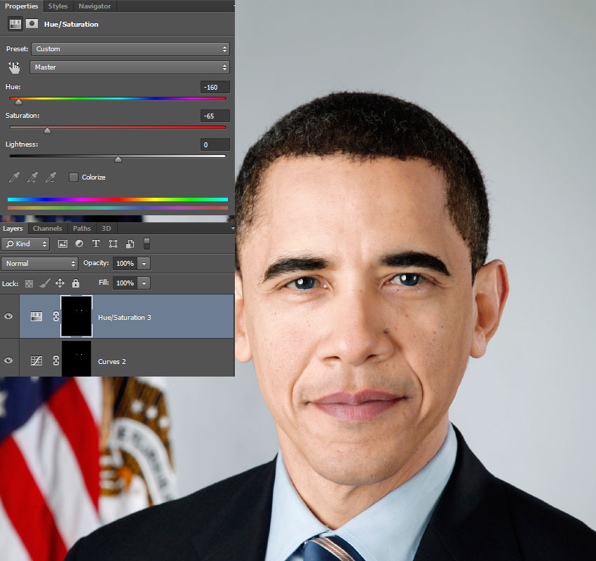
Hue/Saturation
Color Balance
These help you match brightness, contrast, and color harmony between subject and background.
Preparing the Image Before Selection (Critical Step)
Before selecting the subject:
Zoom in to 200–300%
Check edge clarity
Remove obvious dust or spots
Fix extreme exposure issues
This makes the selection process smoother and more accurate.
Duplicate Layers for Safety
Professional workflow always includes backups.
Best Practice:
Duplicate the original image layer
Lock the original layer
Work only on duplicates
This ensures you can always revert if something goes wrong.
Understanding Edge Complexity Before You Start
Not all edges are equal.
Easy Edges:
Hard objects
Clean product outlines
Difficult Edges:
Hair and fur
Fabric fibers
Transparent materials
Knowing this helps you decide:
Which tool to use
How much time to spend
Whether advanced masking is required
Common Preparation Mistakes to Avoid
❌ Starting selection at 100% zoom
❌ Using eraser instead of masks
❌ Ignoring image quality issues
❌ Rushing into color fill without checking edges
Most problems later come from skipping preparation.
Method 1 – How to Change Background Color Using the Quick Selection Tool (Beginner-Friendly Method)

The Quick Selection Tool is the easiest and fastest way to change a background color in Photoshop. It is ideal for beginners and works best when the subject is clearly separated from the background.
This method relies on Photoshop’s smart edge detection, allowing you to select the subject by simply brushing over it.
When to Use the Quick Selection Tool
This method is best for:
Simple backgrounds
High-contrast subjects
Products with clear edges
People without complex hair
⚠️ Avoid this method for:
Hairy or fuzzy edges
Transparent objects
Detailed fabric textures
Step-by-Step: Change Background Color with Quick Selection Tool
Step 1: Open and Prepare the Image
Open your image in Photoshop
Duplicate the background layer
Lock the original layer for safety
This ensures a non-destructive workflow.
Step 2: Select the Quick Selection Tool
Choose the Quick Selection Tool (W)
Set a medium brush size
Make sure “Sample All Layers” is unchecked
Brush size control is critical for clean selections.
Step 3: Select the Subject
Click and drag over the subject
Photoshop automatically expands the selection
Hold Alt/Option to remove unwanted areas
Zoom in while selecting to avoid edge mistakes.
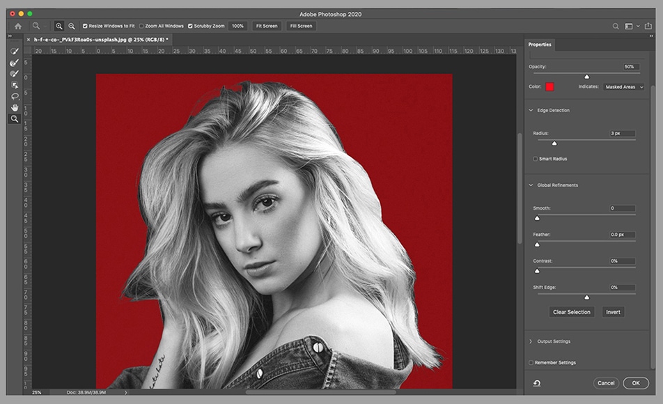
Step 4: Refine the Selection (Very Important)
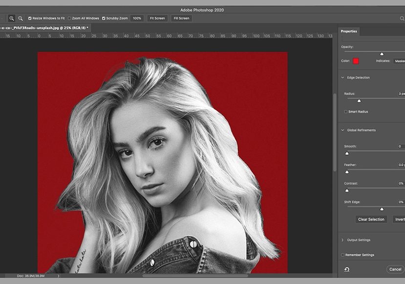
Click Select and Mask
Adjust:
Smooth (reduce jagged edges)
Feather (slight softness)
Contrast (sharper edge)
Use Refine Edge Brush around hair or soft areas
This step separates amateur results from professional ones.
Step 5: Apply a Layer Mask
Click Add Layer Mask
The background becomes hidden
The subject remains intact
Never delete the background—always mask it.
Step 6: Add a New Background Color
Go to Layer > New Fill Layer > Solid Color
Choose your desired background color
Place the color layer below the subject layer
This instantly changes the background color.
Step 7: Fine-Tune the Edges
Select the layer mask
Use a soft black or white brush
Paint gently to clean edges
Work at low opacity (10–30%) for natural results.
How to Choose the Right Background Color
When choosing a background color:
Ensure strong contrast with the subject
Avoid oversaturated colors
Use off-white instead of pure white
Match the mood of the image
Professional edits prioritize realism over brightness.
Common Problems & Quick Fixes
❌ Jagged edges
✔ Use Select and Mask → Smooth
❌ Halo around subject
✔ Paint mask edges with soft brush
❌ Subject looks flat
✔ Add a soft shadow under the subject
Limitations of This Method
While fast and easy, the Quick Selection Tool has limitations:
Struggles with complex edges
Inaccurate for transparent objects
Often leaves halos
For professional or commercial images, advanced methods are preferred.
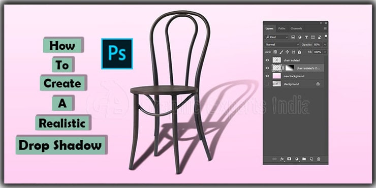
Method 2 – How to Change Background Color Using Layer Masks (Professional & Non-Destructive Method)

If you want clean, realistic, and professional results, changing background color using Layer Masks is the correct approach. Unlike quick methods, this technique gives you full control and allows unlimited corrections without damaging the original image.
This is the method used in professional photo retouching, product editing, portrait editing, and commercial workflows.
Why Layer Masks Are the Professional Standard
Layer masks allow you to hide or reveal parts of a layer without deleting pixels. This makes your edit:
Fully reversible
More precise
Safer for high-resolution images
Suitable for client or commercial work
Professional rule:
If you erase pixels, you’re doing destructive editing. Professionals never do that.
When You Should Use the Layer Mask Method
This method is ideal for:
Portraits and headshots
Product photos
Furniture images
Fashion and apparel
Any image that needs high accuracy
It works especially well when the subject has soft edges or when you need to refine details over time.
Step-by-Step: Change Background Color Using Layer Masks
Step 1: Open and Prepare the Image
Open the image in Photoshop
Duplicate the background layer
Lock the original layer
This protects your original file and keeps your workflow clean.
Step 2: Select the Subject
You can use:
Select Subject (fast and accurate for many images)
Quick Selection Tool (manual control)
Pen Tool (highest accuracy for products and furniture)
The better the selection, the better the final result.
Step 3: Add a Layer Mask
With the subject selected, click Add Layer Mask
The background becomes hidden
The subject remains visible
At this stage, don’t worry about perfection. Refinement comes next.
Step 4: Create a New Background Color Layer
Go to Layer > New Fill Layer > Solid Color
Choose your desired background color
Place this layer below the subject layer
You now have a clean background color behind your subject.
Refining Edges for a Natural Look (Critical Step)
This is where professional results are created.
How to Refine:
Click on the Layer Mask
Select a soft round brush
Use black to hide unwanted areas
Use white to restore details
Work at 10–30% opacity
Zoom in to 200–300% and work slowly.
Handling Hair, Fabric & Soft Edges

For hair and soft edges:
Use Select and Mask
Refine with Refine Edge Brush
Slight feathering helps realism
Avoid hard brush strokes
Pro Tip:
Perfect edges look fake. Slight softness looks natural.
Matching the Subject with the New Background
Once the background color is changed, adjust the subject to match it.
Important Adjustments:
Curves → Match brightness
Color Balance → Match temperature
Hue/Saturation → Reduce color mismatch
These small adjustments prevent the “cut-and-paste” look.
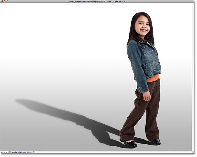
Adding Depth with Shadows
A background color alone can make the subject look flat.
To fix this:
Create a new layer under the subject
Paint a soft shadow with a black brush
Reduce opacity (10–20%)
Blur slightly
This grounding shadow adds realism instantly.
Common Mistakes with Layer Masks
❌ Using a hard brush on edges
❌ Over-feathering the mask
❌ Ignoring color temperature
❌ Forgetting shadows
Layer masks give control—but only if used patiently.
Advantages of the Layer Mask Method
✔ Non-destructive
✔ Professional quality
✔ Unlimited refinement
✔ Works for complex images
✔ Industry-standard technique
This is the method professionals rely on for commercial-ready images.
Method 3 – How to Change Background Color Using the Pen Tool (Most Accurate Method)
When precision matters, the Pen Tool is the most accurate way to change a background color in Photoshop. Unlike automated selection tools, the Pen Tool gives you complete manual control over every curve and edge.
This is the preferred method for:
Product photos
Furniture images
Electronics
Hard-edged objects
Commercial and print-ready work
If you want pixel-perfect edges, this is the method to master.
Why the Pen Tool Produces the Cleanest Results
The Pen Tool creates vector-based paths, not pixel-based selections. This means:
Smooth, sharp edges
No jagged pixels
Consistent results at any zoom level
Ideal for high-resolution images
While it takes more time, the quality difference is significant—especially for professional use.
When You Should Use the Pen Tool
Use the Pen Tool when:
The subject has hard, defined edges
The image is for eCommerce or advertising
Accuracy is more important than speed
AI or Quick Selection fails
⚠️ Avoid using it for:
Hair and fur
Soft, transparent edges
Those require masking or channel techniques.
Step-by-Step: Change Background Color Using the Pen Tool
Step 1: Select the Pen Tool
Choose the Pen Tool (P)
Set mode to Path
Zoom in to at least 200%
Working slowly is essential for accuracy.
Step 2: Create a Path Around the Subject
Click to create anchor points
Drag to create smooth curves
Follow the natural shape of the subject
Use fewer points for smoother paths
Professional Tip:
More anchor points do not mean better accuracy. Fewer, well-placed points produce cleaner edges.
Step 3: Close the Path
Complete the path by clicking the first anchor point
Ensure the path fully encloses the subject
Check carefully for gaps before moving on.
Step 4: Convert Path to Selection
Open the Paths panel
Right-click → Make Selection
Set feather radius to 0.5–1 px (for realism)
This creates a clean, accurate selection.
Step 5: Apply a Layer Mask
With the selection active, click Add Layer Mask
The background is now hidden
The subject remains visible
You now have a perfectly cut subject.
Step 6: Add a New Background Color
Create a Solid Color Fill Layer
Choose your desired background color
Place it below the subject layer
The background color is instantly replaced.
Refining Pen Tool Edges (Pro-Level Touch)
Even with perfect paths, minor refinement improves realism.
Refinement Tips:
Slight feathering prevents harsh edges
Zoom in and inspect curves
Manually clean corners with mask brush
Rule:
Perfectly sharp edges often look fake. Subtle softness looks natural.
Adding Natural Shadows for Realism
After background color change:
Create a new layer under the subject
Paint soft shadows using a low-opacity black brush
Blur slightly if needed
This anchors the subject to the background and prevents floating effects.
Common Pen Tool Mistakes to Avoid
❌ Using too many anchor points
❌ Sharp corners where curves are needed
❌ Forgetting feather settings
❌ Skipping shadow creation
Patience and practice make this method powerful.
Advantages of the Pen Tool Method
✔ Maximum edge accuracy
✔ Ideal for commercial use
✔ Scales well for bulk editing
✔ Preferred for eCommerce & furniture
The Pen Tool remains the industry standard for clipping path and background color replacement.
How to Make the New Background Color Look Natural (Color Matching, Shadows & Realism)
Changing a background color is only half the job. The real challenge is making the subject and background belong together. Without proper color matching, lighting adjustment, and shadows, the image will look cut out—even if the selection is perfect.
Professional editors spend more time on this stage than on selection itself.
Why Background Color Changes Often Look Fake
Most unnatural edits suffer from one or more of these problems:
Subject brightness doesn’t match the background
Color temperature is inconsistent
No grounding shadow
Background is too flat or too saturated
The human eye instantly notices these mismatches.
Step 1: Match Brightness and Contrast (Critical First Step)


Before adjusting color, match light levels.
How to Do It:
Add a Curves adjustment layer
Clip it to the subject layer
Adjust highlights and shadows to match the background
Professional Tip:
If the subject is brighter than the background, it will look pasted on. Always balance brightness first.
Step 2: Match Color Temperature (Warm vs Cool)
Every image has a color temperature:
Warm (yellow/orange tones)
Cool (blue tones)
How to Match:
Use Color Balance
Adjust midtones first
Match background warmth to subject or vice versa
Even a small mismatch makes the edit look artificial.
Step 3: Adjust Saturation for Realism
Over-saturated backgrounds are a common mistake.
Best Practice:
Reduce saturation slightly (5–15%)
Avoid pure RGB colors
Use muted tones for realism
Pro Tip:
Pure white (#FFFFFF) and pure black (#000000) rarely look natural. Slight off-white or dark gray works better.
Step 4: Add Natural Shadows (Most Missed Step)
Without shadows, subjects look like they’re floating.
How to Create a Soft Ground Shadow:
Create a new layer under the subject
Use a soft black brush at 10–20% opacity
Paint lightly under contact areas
Apply slight Gaussian Blur
Shadows should be subtle—not dramatic.
Step 5: Match Edge Softness
Edges that are too sharp often look fake.
Fix It By:
Slightly feathering the mask (0.5–1px)
Softening edges with a low-opacity brush
Avoiding hard transitions
Natural edges are rarely razor-sharp.
Step 6: Add Background Texture or Gradient (Optional but Powerful)
Flat backgrounds can look unnatural in some cases.
When to Use:
Portraits
Furniture images
Marketing visuals
How:
Add a subtle gradient
Introduce very light noise
Keep texture extremely soft
This adds depth without distraction.
Professional Checklist for Realism
Before finalizing, check:
Does the light direction match?
Are shadows present?
Is color temperature consistent?
Are edges natural?
Does anything feel “cut out”?
If something feels off, it usually is.
Common Mistakes That Kill Realism
❌ Ignoring shadows
❌ Over-saturated backgrounds
❌ Mismatched brightness
❌ Pure white backgrounds
❌ Over-feathered edges
Fixing these instantly improves quality.
Common Background Color Change Mistakes in Photoshop (And How to Fix Them Like a Pro)
Even when you follow the correct steps, background color changes can still look unnatural. That’s because most issues don’t come from the tools themselves—they come from small technical mistakes that compound visually.
In this part, we’ll break down the most common background color change mistakes in Photoshop and show you exactly how professionals fix them.
Mistake 1: Jagged or Rough Edges Around the Subject
Why It Happens
Low-resolution images
Poor selection refinement
Using hard brushes on masks
Jagged edges are one of the fastest ways to make an edit look amateur.
How to Fix It
Zoom in to 200–300%
Open Select and Mask
Increase Smooth slightly
Add 0.5–1 px feather
Use a soft brush on the layer mask
Pro Tip:
Edges should look natural—not perfectly sharp.
Mistake 2: White or Dark Halo Around the Subject
Why It Happens
Original background color bleeding into edges
Poor masking around hair or fine details
Halos are especially visible on dark or colored backgrounds.
How to Fix It
Open Select and Mask
Enable Decontaminate Colors
Use Defringe (1–2 px) if needed
Manually clean edges with low-opacity brush
This removes leftover background color contamination.
Mistake 3: Subject Looks Like It’s Floating
Why It Happens
No grounding shadow
Flat background color
Ignoring light direction
Without shadows, the subject has no connection to the background.
How to Fix It
Create a new layer under the subject
Paint a soft black shadow (10–20% opacity)
Blur slightly for realism
Match shadow direction to light source
Shadows should be subtle, not dramatic.
Mistake 4: Background Color Looks Too Strong or Fake
Why It Happens
Over-saturated colors
Using pure RGB colors
No tonal balance
Bright backgrounds easily overpower the subject.
How to Fix It
Reduce saturation by 5–15%
Use muted or off-white tones
Match background brightness with Curves
Avoid pure white (#FFFFFF)
Professional backgrounds are rarely pure colors.
Mistake 5: Mismatched Color Temperature
Why It Happens
Subject shot in warm light
Background color is cool (or vice versa)
Even subtle temperature differences look unnatural.
How to Fix It
Use Color Balance
Adjust midtones first
Match background warmth to subject
Fine-tune highlights and shadows
Consistency matters more than accuracy.
Mistake 6: Over-Feathered or Blurry Edges
Why It Happens
Too much feathering
Heavy blur on mask
Over-smoothing in Select and Mask
Over-feathering makes the subject look soft and unrealistic.
How to Fix It
Reduce feather to under 1 px
Increase mask contrast slightly
Manually sharpen edges where needed
Edges should be clean but natural.
Mistake 7: Using the Eraser Tool Instead of Masks
Why It Happens
Beginner habit
Lack of non-destructive workflow
Once erased, pixels are gone forever.
How to Fix It
Stop using the Eraser Tool
Always use Layer Masks
Paint with black/white instead
Non-destructive editing is mandatory for professional work.
Mistake 8: Ignoring Image Quality Limits

Why It Happens
Low-resolution or compressed images
Motion blur or noise
Photoshop can’t create detail that doesn’t exist.
How to Fix It
Work with highest-quality source files
Reduce expectations on low-res images
Avoid extreme background contrasts
Sometimes the limitation is the image—not your skill.
Professional Troubleshooting Checklist
Before final export, ask:
Are edges clean at 300% zoom?
Is there any halo or color bleed?
Do shadows match the light direction?
Does the background overpower the subject?
Does the image feel natural?
If the answer is “no” to any of these, refine further.
Photoshop vs AI & Online Background Color Tools (Which One Should You Use?)
With the rise of AI-powered tools, many people ask:
“Why use Photoshop when AI tools can change background color instantly?”
The answer depends on quality, control, and purpose. In this part, we’ll compare Photoshop vs AI and online background color tools honestly—so you know exactly which option fits your needs.
Overview: Photoshop vs AI Tools
At a glance, AI tools focus on speed, while Photoshop focuses on accuracy and realism.
| Feature | Photoshop | AI / Online Tools |
|---|---|---|
| Accuracy | Very high | Medium |
| Edge Control | Full manual | Limited |
| Hair & Details | Excellent (manual) | Often fails |
| Shadows & Realism | Fully customizable | Minimal or none |
| Commercial Use | Safe & professional | Risky |
| Speed | Slower | Very fast |
How AI Background Color Tools Work
AI tools use machine learning to:
Detect the subject automatically
Remove or replace the background
Apply preset colors or styles
Popular AI tools include:
Online background changers
Mobile apps
Built-in website editors
They are designed for quick results, not perfection.
Strengths of AI & Online Tools
AI tools are useful when:
You need instant results
Image quality requirements are low
Backgrounds are very simple
You’re creating casual content
Advantages:
✔ Extremely fast
✔ No Photoshop skills required
✔ Beginner-friendly
✔ Often free or low-cost
For social media or personal use, AI tools can be enough.
Limitations of AI Tools (Important)

AI tools struggle with:
Hair and fur
Transparent objects
Fine edges
Color contamination
Realistic shadows
They often:
Leave halos
Flatten depth
Ignore lighting direction
These flaws are immediately noticeable in professional or commercial images.
Why Photoshop Still Dominates Professional Work
Photoshop allows editors to:
Control every pixel manually
Choose the best selection method
Refine edges precisely
Match color, light, and texture
Create natural shadows and depth
For:
eCommerce product images
Furniture photos
Fashion & apparel
Advertising creatives
Photoshop remains the industry standard.
Speed vs Quality: The Real Trade-Off
AI tools win on speed. Photoshop wins on quality.
Choose AI tools if:
Speed matters more than quality
The image is low-stakes
You don’t need perfection
Choose Photoshop if:
Image quality affects sales
You need realistic results
The image is client-facing
Brand consistency matters
Professional brands always choose quality.
Commercial & Legal Considerations
This is often overlooked.
AI Tools:
May compress image quality
Sometimes restrict commercial usage
Limited export control
Photoshop:
Full ownership of edits
High-resolution exports
Safe for print and ads
For commercial projects, Photoshop is the safer choice.
Hybrid Workflow Used by Professionals
Some professionals use a hybrid approach:
Use AI for quick rough selection
Import into Photoshop
Refine edges manually
Add shadows and color matching
This saves time without sacrificing quality.
Which One Should You Choose? (Simple Answer)
Casual / personal use: AI tools
Professional / business use: Photoshop
High-volume + quality needs: Photoshop or professional services
There is no shortcut to realism.
Advanced Background Color Techniques in Photoshop (Gradients, Blend If, Reflections & Pro Tricks)
Once you understand the basics of changing background color in Photoshop, the next step is learning advanced techniques that add depth, realism, and polish. These methods are commonly used in advertising, eCommerce, furniture photography, and high-end retouching.
This part focuses on techniques professionals use to make background color changes look intentional and realistic, not flat or artificial.
Using Gradient Backgrounds Instead of Flat Colors
Flat background colors often look unnatural, especially for portraits, furniture, and lifestyle images. Gradients introduce subtle depth.
When to Use Gradients:
Portraits and headshots
Furniture and interior images
Marketing visuals
Editorial-style photos
How to Create a Gradient Background:
Add a Gradient Fill Layer
Choose a soft light-to-dark gradient
Keep contrast subtle
Position the lighter area near the subject
Professional Tip:
Gradients should be barely noticeable. If you can clearly see the gradient, it’s too strong.
Using “Blend If” for Natural Edge Blending
The Blend If sliders are one of Photoshop’s most powerful but underused tools.
What Blend If Does:
Blends layers based on brightness
Helps edges merge naturally
Reduces harsh transitions
How to Use Blend If:
Double-click the subject layer
Locate Blend If
Adjust the background sliders
Hold Alt/Option to split sliders for smooth blending
This technique is excellent for:
Hair edges
Soft shadows
Natural light blending
Adding Realistic Reflections (Products & Furniture)
Reflections add realism, especially for:
Furniture
Electronics
Glass products
How to Create a Reflection:
Duplicate the subject layer
Flip it vertically
Lower opacity
Add a gradient mask
Blur slightly
Reflections should be subtle and never overpower the subject.
Matching Background Color with Subject Color (Color Harmony)
Advanced editors ensure the background complements—not competes with—the subject.
Best Practices:
Use muted background tones
Avoid matching subject color exactly
Create contrast through brightness, not saturation
Professional Insight:
A background that’s too similar in color reduces subject separation.
Using Noise and Texture for Realism
Perfectly smooth backgrounds often look fake.
How to Add Subtle Texture:
Add a new layer
Fill with 50% gray
Add minimal noise (1–2%)
Set blend mode to Overlay or Soft Light
This simulates natural camera grain and improves realism.
Advanced Shadow Control Techniques
Professional shadows are layered and directional.
Pro Shadow Tips:
Use multiple shadow layers
Vary opacity and blur
Match light direction
Avoid uniform shadows
This creates depth and realism instantly.
Using Adjustment Layers to Tie Everything Together
Final polish is done with global adjustments.
Useful Adjustments:
Curves (overall balance)
Color Lookup (creative grading)
Hue/Saturation (fine tuning)
Levels (contrast control)
Apply adjustments subtly and clip when necessary.
Common Advanced Mistakes to Avoid
❌ Overusing gradients
❌ Heavy reflections
❌ Extreme textures
❌ Over-stylized shadows
Advanced techniques should enhance—not distract.
Professional Workflow Tip
Advanced editors often:
Build the background first
Adjust lighting and depth
Then refine subject edges
Finalize with color grading
This top-down approach saves time and improves consistency.
Background Color Change for Different Image Types (Products, Portraits, Furniture, Fashion & Jewelry)

Not all images should be edited the same way. One of the biggest differences between beginner and professional editors is knowing which background color method works best for each image type.
In this part, you’ll learn how background color change strategies vary depending on the subject—and why using the wrong method can ruin an otherwise good image.
1. Product Photos (eCommerce & Marketplaces)
Product images demand accuracy, cleanliness, and compliance.
Primary Goals:
Clear product visibility
Accurate color representation
Marketplace approval (Amazon, Shopify, Etsy)
No halos, no distractions
Recommended Background Colors:
Off-white (preferred over pure white)
Light gray
Brand-neutral tones
Best Method:
Pen Tool + Layer Mask
Manual edge refinement
Shadow recreation under the product
Professional Notes:
Pure white backgrounds often look harsh
Soft ground shadows increase trust
Consistency across all product images is critical
This workflow is standard in professional product photo editing and clipping path services.
2. Portraits & Headshots (Corporate & Creative)
Portrait background color changes require subtlety. The face, hair, and skin tones must remain natural.
Primary Goals:
Natural skin tones
Soft hair edges
Professional mood
Recommended Background Colors:
Neutral gray
Soft beige
Light blue
Muted brand colors
Best Method:
Select Subject + Layer Mask
Manual hair refinement
Color temperature matching
Professional Notes:
Background should never overpower the face
Neutral tones convert better for corporate use
Creative portraits allow slightly stronger colors
3. Furniture & Interior Images
Furniture images are all about scale, grounding, and realism. Poor background editing makes furniture look fake instantly.
Primary Goals:
Preserve texture and material detail
Maintain realistic scale
Proper grounding with shadows
Recommended Background Colors:
Soft gray
Light beige
Interior-style neutral tones
Best Method:
Pen Tool for structure
Layer Mask refinement
Manual contact shadows
Professional Notes:
Never remove all shadows
Flat backgrounds without grounding reduce buyer confidence
Texture preservation is more important than speed
This category almost always requires manual Photoshop editing, not AI tools.
4. Fashion & Apparel Images
Fashion images involve fabric fibers, folds, and soft edges, making background color changes more complex.
Primary Goals:
Clean fabric edges
Natural folds and texture
No visible cutout lines
Recommended Background Colors:
White or off-white
Light gray
Campaign brand colors
Best Method:
Advanced Image Masking
Combination of layer masks and channels
Careful edge refinement
Professional Notes:
Avoid aggressive smoothing
Fabric texture must remain visible
Hair and clothing often require separate masking
This is why apparel editing is considered an advanced skill.
5. Jewelry & Transparent Objects (Most Difficult)
Jewelry editing is the most technically demanding category.
Why It’s Challenging:
Transparency
Reflections
Light refraction
Fine details
Recommended Background Colors:
Soft gray
Controlled gradients
Neutral dark or light tones
Best Method:
Channel-based masking
Multiple layer masks
Reflection and highlight recreation
Professional Notes:
AI tools almost always fail here
Edge contamination is common
Manual control is mandatory
If transparency is involved, Photoshop expertise is non-negotiable.
6. Social Media & Marketing Graphics
Marketing images allow more creative freedom—but still require discipline.
Primary Goals:
Visual impact
Brand alignment
Platform compatibility
Recommended Background Colors:
Brand colors
Gradients
High-contrast combinations
Best Method:
Select Subject or Pen Tool
Solid or gradient fill layers
Soft shadows or glow effects
Professional Notes:
Test different background colors
Small color changes can significantly impact engagement
Consistency matters across campaigns
Quick Reference Table: Best Method by Image Type
| Image Type | Best Method | Skill Level |
|---|---|---|
| Product | Pen Tool + Mask | Advanced |
| Portrait | Select Subject + Mask | Intermediate |
| Furniture | Pen Tool + Shadows | Advanced |
| Fashion | Image Masking | Advanced |
| Jewelry | Channel Masking | Expert |
| Marketing | Mixed Methods | Beginner–Intermediate |
Why Professionals Change Their Approach by Image Type
Professional editors don’t rely on one tool. They:
Analyze the subject
Choose the right method
Adjust color and shadows accordingly
Deliver purpose-driven results
This adaptability is what produces consistent, high-quality images across industries.
Professional Photoshop Workflow for Background Color Changes (How Agencies Do It at Scale)
Changing background color for one image is easy.
Changing background color for hundreds or thousands of images—consistently, accurately, and on deadline—is a completely different challenge.
This is where professional agencies and experienced editors separate themselves from casual Photoshop users.
In this part, you’ll learn how professionals handle background color changes at scale, while maintaining quality, speed, and consistency.
Why a Professional Workflow Matters
Without a structured workflow, large projects suffer from:
Inconsistent background colors
Uneven edge quality
Color mismatch across images
Slower turnaround times
Costly rework
A professional workflow solves these problems before they happen.
Step 1: Image Assessment Before Editing Begins
Professional teams never start editing immediately.
They first analyze:
Image resolution and quality
Edge complexity (hair, fabric, transparency)
Lighting direction
Intended platform (eCommerce, ads, print)
This assessment determines:
Which selection method to use
How much time each image needs
Whether automation is safe or not
Pro Insight:
Using the wrong method wastes more time than starting slow.
Step 2: Standardized Folder & File Structure
Agencies use strict file organization.
Typical Structure:
Originals (never edited)
Working PSDs
Final Exports
Client Review Files
Each PSD includes:
Clearly named layers
Grouped background, subject, and adjustments
Locked original layers
This prevents confusion and speeds up revisions.
Step 3: Non-Destructive Editing Only
Professional editors never destroy pixels.
Standard Rules:
Always use layer masks
Always use adjustment layers
Never flatten PSDs until final export
Keep edits reversible
This allows:
Easy revisions
Color changes without redoing work
Client-requested tweaks
Non-destructive editing saves time long-term.
Step 4: Batch Consistency & Color Control
For large sets, consistency matters more than individual perfection.
Professional Techniques:
Use reference images
Match background color values exactly
Reuse gradient presets
Apply identical adjustment layers
Editors often keep:
HEX/RGB color values documented
Shadow opacity standards
Export size presets
This ensures visual uniformity across the entire catalog.
Step 5: Quality Control (QC) Checklist
Professional agencies use a strict QC process.
QC Checklist Includes:
Edge quality at 300% zoom
No halos or color spill
Background color consistency
Natural shadows present
Correct export size and format
Images that fail QC are corrected before delivery—never after.
Step 6: Speed Without Sacrificing Quality
Speed comes from process, not rushing.
How Professionals Stay Fast:
Use the right tool for the image
Avoid over-editing
Apply reusable presets
Divide tasks logically in teams
AI may assist with rough selections, but final control is always manual.
Step 7: Exporting for Different Platforms
Professional exports are platform-specific.
Common Export Standards:
Web: JPEG / sRGB / optimized size
eCommerce: High-res JPEG / white or neutral background
Print: TIFF or high-quality JPEG
Incorrect export settings can ruin even perfect edits.
Step 8: Revision & Feedback Handling
Professionals expect revisions.
Best Practices:
Keep editable PSD files
Label version numbers clearly
Apply feedback consistently across all images
This builds client trust and long-term relationships.
Why Businesses Outsource Background Color Editing
Many brands outsource because:
In-house editing is slow
Consistency is hard to maintain
Skilled editors are expensive
Scale is difficult during peak seasons
Professional services deliver:
Faster turnaround
Lower cost per image
Consistent quality
This is why agencies and brands rely on dedicated photo editing teams.
Troubleshooting Difficult Background Color Changes (Hair, Transparency & Low-Quality Images)
Not every image behaves nicely. In professional work, you will often face images where changing the background color feels almost impossible—hair blends into the background, transparent objects lose realism, or low-quality photos fall apart during selection.
This part explains how professionals troubleshoot the hardest background color change scenarios in Photoshop.
Problem 1: Hair Blending Into the Background
Hair is one of the most challenging elements in Photoshop because:
It has fine strands
It often blends with the background
Automated tools struggle with it
Why Selections Fail
Low contrast between hair and background
Overuse of Quick Selection
Hard-edged masking
Professional Fix:
Use Select and Mask
Paint over hair using Refine Edge Brush
Enable Decontaminate Colors
Manually refine with low-opacity brush
Pro Tip:
Don’t aim to isolate every hair strand. Aim for natural blending.
Problem 2: Fringing or Color Spill Around Edges

Fringing happens when the original background color bleeds into the subject edges.
Why It Happens:
Strong colored backgrounds
Inaccurate masking
Compression artifacts
How to Fix It:
Go to Layer > Matting > Defringe (1–2 px)
Use Color Balance on edges
Paint mask edges carefully
This is especially important when switching from dark to light backgrounds.
Problem 3: Transparent or Semi-Transparent Objects

Objects like glass, plastic, or jewelry reflect and transmit light.
Why It’s Difficult:
Transparency depends on background color
Reflections must remain realistic
Simple masking destroys realism
Professional Solution:
Use Channel-based masking
Keep highlights and reflections
Rebuild transparency manually if needed
Rule:
Never make transparent objects fully opaque.
Problem 4: Low-Resolution or Blurry Images
Low-quality images limit what Photoshop can do.
Common Issues:
Jagged edges
Noise around selections
Loss of detail
How Professionals Handle It:
Reduce contrast between subject and background
Use softer backgrounds
Avoid extreme color changes
Set realistic expectations
Sometimes the best solution is damage control, not perfection.
Problem 5: Complex Backgrounds with Similar Colors
When the subject color matches the background, automated tools fail.
Professional Fix:
Use Pen Tool where possible
Combine multiple selection methods
Manually paint the mask
Work slowly at high zoom
This is where experience matters more than tools.
Problem 6: Edge Looks Too Sharp or Too Soft
Why It Happens:
Over-feathering the mask
Using hard brushes
Incorrect feather radius
How to Fix It:
Use 0.5–1 px feather
Blend edges manually
Match edge softness to image resolution
Edges should match the camera’s original sharpness.
Problem 7: Background Color Change Ruins Lighting Direction

Background color alone can break realism if lighting is ignored.
Professional Fix:
Observe original light direction
Add shadows consistently
Avoid flat lighting
Lighting must feel logical—even subconsciously.
Professional Troubleshooting Workflow
When something looks wrong:
Zoom in to 300%
Check edges for halos
Match brightness first
Match color temperature
Add or refine shadows
Professionals fix issues systematically, not randomly.
When to Stop Editing
One of the most important skills is knowing when to stop.
Stop refining when:
Improvements become invisible
Edges match image quality
Background feels natural
Over-editing often makes images worse.
Background Color Psychology for eCommerce & Branding (High-Conversion Insight)
Changing background color in Photoshop is not just a technical task—it’s a strategic branding and conversion decision. The color behind a product or subject directly influences how customers feel, how much they trust the brand, and whether they decide to buy.
Professional eCommerce brands and advertisers choose background colors deliberately, not randomly.
Why Background Color Affects Buying Decisions
Human brains process color faster than text. Before a customer reads product details, they subconsciously react to the image.
Background color influences:
First impressions
Perceived quality
Trust and credibility
Emotional response
Purchase intent
This is why background color choice plays a key role in conversion optimization.
The Most Effective Background Colors for eCommerce
1. White Background (Trust & Clarity)
White is the most widely used background color in eCommerce.
Why It Works:
Clean and distraction-free
Makes products easy to evaluate
Accepted by all major marketplaces
Signals professionalism and transparency
Pro Tip:
Use off-white instead of pure white to avoid harsh contrast.
2. Light Gray (Premium & Balanced)
Light gray backgrounds feel modern and premium.
Best For:
Fashion and apparel
Electronics
Furniture and home decor
Gray allows product colors to stand out without overwhelming the viewer.
3. Neutral Warm Tones (Lifestyle & Comfort)
Beige, cream, and soft warm tones create a lifestyle feel.
Best For:
Furniture
Home accessories
Organic and handmade products
These colors evoke comfort and realism.
4. Brand Colors (Recognition & Consistency)
Using brand colors in backgrounds builds recognition.
Best Practices:
Keep saturation low
Maintain strong contrast
Use consistently across images
Brand colors work best for:
Promotional banners
Social media ads
Campaign-specific images
5. Dark Backgrounds (Luxury & Drama)
Dark backgrounds create contrast and sophistication.
Best For:
Jewelry
Luxury products
Watches
Premium electronics
⚠️ Use carefully—dark backgrounds require perfect lighting and edges.
How Background Color Impacts Perceived Product Value
Customers often associate:
Clean backgrounds → higher quality
Consistent visuals → reliable brand
Messy or inconsistent backgrounds → untrustworthy sellers
A poorly chosen background can reduce perceived value—even if the product itself is excellent.
Platform-Specific Background Color Strategy
Amazon
White or off-white preferred
No distractions
Focus entirely on the product
Shopify
More flexibility
Neutral or brand-aligned colors
Consistency across collections
Social Media Ads
High contrast works best
Brand colors improve recall
Bold but controlled backgrounds
Adapting background color to platform expectations improves performance.
Psychological Mistakes That Hurt Conversions
❌ Over-saturated backgrounds
❌ Using trendy colors without strategy
❌ Low contrast between product and background
❌ Inconsistent backgrounds across listings
Consistency builds trust. Random choices break it.
Testing Background Colors for Higher Conversions
Professional brands test background colors just like they test ad copy.
What to Test:
White vs light gray
Neutral vs brand color
Flat vs gradient
Small changes can lead to measurable conversion improvements.
How Professionals Use Photoshop for Color Strategy
Photoshop allows:
Exact color matching
Controlled gradients
Non-destructive testing
Easy A/B variations
This flexibility makes Photoshop ideal for conversion-focused image optimization.
When to Edit Yourself vs Outsource Background Color Editing (Time, Cost & Scale)
Learning how to change background color in Photoshop is a valuable skill—but not every situation requires you to do it yourself. As projects grow in size, complexity, or urgency, many professionals and businesses face an important decision:
Should you edit background colors yourself, or outsource the work to professionals?
The right choice depends on time, cost, scale, and quality requirements.
When It Makes Sense to Edit Background Colors Yourself
Editing in-house or by yourself is a good option when:
You have time to edit carefully
The number of images is small
You need full creative control
You’re still learning or practicing Photoshop
The images are not time-sensitive
Best Scenarios for DIY Editing:
Personal projects
Portfolio work
Small product batches
Creative experimentation
DIY editing builds skill—but it also consumes time.
Hidden Costs of Editing Everything Yourself
Many people underestimate the real cost of DIY editing.
Common Hidden Costs:
Time spent selecting, masking, refining
Rework due to mistakes
Inconsistent results across images
Burnout during large projects
For businesses, time spent editing is time not spent on marketing, sales, or growth.
When Outsourcing Background Color Editing Makes Sense
Outsourcing becomes the smarter option when:
You have large image volumes
Consistency across images is critical
Turnaround time matters
You need professional-grade quality
You want predictable results
Typical Outsourcing Use Cases:
eCommerce catalogs
Furniture and product photography
Fashion and apparel brands
Advertising agencies
Seasonal or bulk image updates
Professional editors follow proven workflows that reduce errors and rework.
Cost vs Value: The Real Comparison
DIY editing may look cheaper—but value matters more than cost.
| Factor | DIY Editing | Outsourcing |
|---|---|---|
| Time investment | High | Low |
| Consistency | Varies | High |
| Skill requirement | High | None |
| Scalability | Limited | Easy |
| Final quality | Depends | Professional |
For growing businesses, outsourcing often saves money in the long run.
How Professional Editing Services Work
Professional services typically offer:
Non-destructive Photoshop workflows
Quality control checks
Consistent background colors
Natural shadows and realism
Fast turnaround times
You get clean, ready-to-use images—without managing the editing process yourself.
Hybrid Approach Used by Smart Teams
Many professionals use a hybrid model:
DIY for creative or one-off edits
Outsource bulk or time-sensitive work
This approach balances control and efficiency.
Quality Consistency: The Biggest Advantage of Outsourcing
Consistency is hard to maintain when editing hundreds of images.
Professional teams:
Follow standardized color values
Match shadows and brightness
Deliver uniform results across catalogs
Consistency builds brand trust and improves customer experience.
Final Decision Guide
Choose DIY editing if:
You enjoy editing
Volume is low
Deadlines are flexible
Choose outsourcing if:
Volume is high
Quality affects sales
Speed and consistency matter
There is no wrong choice—only the right choice for your situation.
Final Takeaway of the Entire Guide
Changing background color in Photoshop is both a technical skill and a strategic decision. From selection tools and advanced masking to realism, psychology, and workflow, every step influences how an image is perceived.
Mastering this process gives you creative control. Knowing when to outsource gives you scalability and efficiency.
Together, they help you produce images that look professional, build trust, and convert better.
Case Study: How Changing Background Color Increased Conversions for an Ecommerce Brand
The Problem
An online fashion accessories brand was struggling with:
Inconsistent background colors across product images
Greyish-white tones instead of pure white
Distracting shadows and uneven lighting
High product return rate due to color perception issues
Their product page looked visually messy. Some images had cream backgrounds, others light gray, and some slightly blue-tinted whites.
The result?
Lower perceived brand value
Reduced trust
Decreased add-to-cart rate
The Solution
The editing team used Adobe Photoshop and implemented:
1️⃣ Object Selection Tool
To cleanly separate the product from the background.
2️⃣ Layer Mask Workflow
Instead of deleting backgrounds, they used non-destructive masking for better edge refinement.
3️⃣ Solid White Fill Layer
Set to RGB 255,255,255 for ecommerce compliance.
4️⃣ Shadow Preservation
Natural drop shadows were preserved to avoid the “floating product” effect.
The Results (After 30 Days)
After updating 120 product images:
📈 Conversion rate increased by 18%
📉 Return rate reduced by 12%
⏱️ Time spent on product pages increased
💬 Customer complaints about color mismatch dropped significantly
Why?
Because clean, consistent backgrounds:
Improve perceived quality
Make product colors appear accurate
Build buyer trust
Remove distractions
Frequently Asked Questions (FAQs)
1. How do you change the background color in Photoshop without affecting the subject?
The best way is to:
Select the subject using Object Selection Tool in Adobe Photoshop
Click Select > Inverse to select the background
Add a Solid Color Fill Layer
Using a Layer Mask instead of deleting the background keeps the edit non-destructive and more professional.
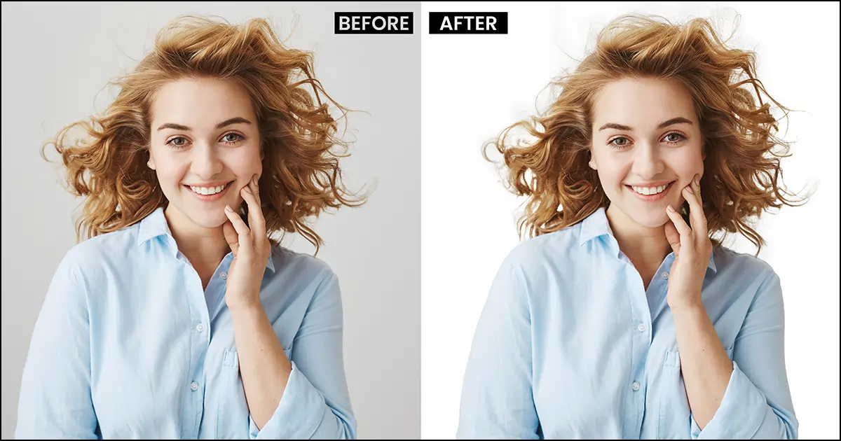
2. How do I change a background to white in Photoshop?
To change the background to white:
Select the subject
Invert the selection
Delete the background
Add a Solid Color Fill Layer
Set RGB values to 255, 255, 255
For ecommerce platforms like Amazon, pure white (#FFFFFF) is usually required.
3. What is the fastest way to change background color in Photoshop?
The fastest method is:
Use Object Selection Tool
Click Select Subject
Invert selection
Add Solid Color Layer
This works best when the image has high contrast between subject and background.
4. How do I change the background color without deleting it?
Instead of pressing delete:
Add a Layer Mask
Mask out the background
Add a color layer underneath
This allows you to edit or adjust later without losing image data.
Professional retouchers prefer this workflow.
5. Why does my selection look rough or jagged?
This usually happens because:
Low image resolution
Poor contrast between subject and background
Incorrect feather or smooth settings
Use Select and Mask and adjust:
Smooth
Feather
Contrast
Shift Edge
Zoom in to refine small details like hair, fabric edges, or product curves.
6. How do I change the background color to any custom brand color?
After removing the background:
Create a Solid Color Fill Layer
Enter the HEX code of your brand color
Place the layer below your subject
This is commonly used for:
Ecommerce banners
Social ads
Product hero images
Shopify product pages
7. Can I change the background color in Photoshop without selecting the object?
Yes, if the background is a solid color, you can:
Use the Magic Wand Tool
Click on the background
Adjust tolerance
Replace it with a new fill color
However, this works best when the background is uniform and high contrast.
8. What tool is best for changing background color in Photoshop?
It depends on the image:
Object Selection Tool → Best for most modern edits
Quick Selection Tool → Good for manual control
Pen Tool (Clipping Path) → Best for sharp product edges
Layer Mask → Best for non-destructive editing
For ecommerce product images, Object Selection + Layer Mask is typically the most efficient workflow.
9. How do I keep natural shadows when changing background color?
Instead of deleting everything:
Refine your selection carefully
Preserve natural shadows
Add a soft brush adjustment
Adjust brightness/contrast slightly after adding new background
Shadows make product images look realistic and prevent the “floating object” effect.
10. Can beginners change background color in Photoshop easily?
Yes. With modern versions of Adobe Photoshop, tools like:
Select Subject
Object Selection Tool
Remove Background button
have made the process much easier than older versions.
Even beginners can achieve professional results with basic practice.
🚀 Ready to Standardize Your Product Backgrounds at Scale?
Changing background color in Photoshop is simple.
Maintaining visual consistency across 500+ SKUs?
That’s where most ecommerce brands struggle.
If your catalog has:
Inconsistent white tones
Uneven shadows
Fabric colors looking different across products
High return rates due to color mismatch
It’s not just an editing issue — it’s a conversion issue.
Our team specializes in background correction and ecommerce image standardization using professional workflows in Adobe Photoshop — designed specifically for scaling product catalogs.
What We Help Ecommerce Teams Achieve:
✔ Pure white (#FFFFFF) marketplace compliance
✔ Brand-consistent background tones
✔ Natural shadow preservation
✔ Bulk editing workflows
✔ Faster turnaround for large SKU volumes
📊 Let’s Audit 5 of Your Product Images (Free)
We’ll review your current background consistency and show you:
Where visual friction is hurting conversions
How background tone impacts product color accuracy
What workflow improvements can scale your catalog
No obligation. Just practical insight your team can use immediately.