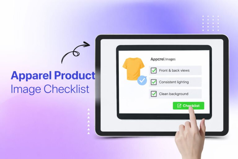
A new clothing collection usually comes together under pressure. Samples arrive late, the shoot gets squeezed into a tight window, and product pages need to go live on a fixed date. In that rush, images often get approved because they “look fine” on a laptop screen, not because anyone checked them properly. A structured apparel product image checklist gives your team a clear way to answer one practical question before launch: are our product images actually ready?
This guide walks through every stage of that review, from shot coverage and color accuracy to platform specifications, file naming, and final sign-off. It is written for fashion brands, apparel retailers, ecommerce managers, photographers, and product teams who want fewer surprises after the collection is published.
Why a Pre-Launch Image Review Matters
In online apparel, the product image does most of the work a fitting room would do in a physical store. Shoppers cannot touch the fabric, check the stitching, or see how a garment hangs. They rely on photos to judge color, texture, fit, and quality.
When images are inconsistent or inaccurate, the problems tend to show up later: customer questions about color, returns because an item “looked different online,” listings rejected by a marketplace, or a collection page that looks uneven because every product was cropped differently.
A pre-launch review will not guarantee sales. What it can do is make product information clearer, create consistency across the collection, and may reduce avoidable image-related issues before customers or platforms find them for you. It also gives your team a shared standard, so approval is based on criteria rather than personal taste.
How to Use This Checklist
The most practical approach is to review images in three passes rather than trying to catch everything at once:
- Content pass: Is every required shot present, and does each image show the product accurately?
- Consistency pass: Do the images look like they belong to the same collection and the same brand?
- Technical pass: Do the files meet the size, format, naming, and platform requirements for every channel where they will appear?
Assign one person as the final approver for each pass. When everyone is responsible for quality, often no one checks the details.
1. Shot Coverage: Does Each Product Have the Right Images?
Missing angles are one of the most common gaps in apparel product photography. A shopper who cannot see the back of a dress or the inside of a jacket has to guess, and guessing tends to create hesitation.
How many product images should a clothing product have?
There is no universal number, but many apparel brands work with a core set of five to eight images per product, plus additional images for each colorway. A practical baseline looks like this:
- Front view
- Back view
- Side or three-quarter view
- Close-up of fabric texture
- Close-up of key details (buttons, zippers, embroidery, labels, pockets)
- On-model or styled image to show fit and scale
- Interior view where relevant (linings, jackets, structured pieces)
- Flat lay or ghost mannequin image for a clean catalog look
Complex or higher-priced items, such as outerwear, tailoring, or technical sportswear, often need more coverage than a basic t-shirt.
Checklist
- Every product has the agreed minimum number of images
- Front, back, and side views are included
- At least one detail shot shows fabric texture clearly
- Important construction details are visible
- Every colorway has its own images, not just a swatch
- Fit is shown on a model or through a consistent mannequin presentation
- Size and scale are clear (model height and size worn can be noted in the product copy)
Create a written shot list before the shoot and compare final images against it. This single step catches many gaps early.
2. Product Accuracy: Does the Image Match the Real Garment?
An image can be beautiful and still misrepresent the product. Accuracy should come before aesthetics.
Color accuracy
Color is one of the most frequent sources of customer confusion in apparel ecommerce. Lighting, camera settings, and editing can all shift a color away from the physical garment.
- Compare each image side by side with the physical sample under neutral light
- Check difficult colors carefully (navy vs. black, burgundy vs. brown, off-white vs. cream, neon shades)
- Confirm that the color name in the listing matches what the image shows
- Review images on more than one screen, including a phone
A gray card or color checker in a reference shot during the photoshoot can help editors match colors more reliably later.
Fabric and texture
- Texture is visible (knit, weave, denim wash, sheen, matte finish)
- Transparent or sheer fabrics are shown honestly
- Retouching has not smoothed away texture that is part of the product
Fit and proportion
- Garment is not pinned or clipped so tightly that it misrepresents the fit
- Length, sleeve shape, and silhouette look true to the actual product
- Model images do not distort proportions through extreme angles or lens choice
Details and components
- Hardware color (gold, silver, gunmetal) matches the product
- Prints and patterns are aligned and not cropped in misleading ways
- Labels, logos, and trims match the final production version, not an earlier sample
That last point matters more than many teams expect. Collections are often shot on pre-production samples, and small changes between sample and final product (a different button, a changed trim color) can make the image inaccurate at launch.
3. Color Consistency Across the Collection
Accuracy looks at each product individually. Consistency looks at how products sit together on a category page.
When images from different shoot days or different photographers sit side by side, white balance and exposure differences become obvious. One white shirt looks slightly blue, another slightly yellow, and the collection starts to feel unpolished.
Checklist
- White balance is consistent across all products
- Exposure and brightness levels match
- Whites are clean and neutral, not tinted
- Blacks retain detail and are not crushed into flat shapes
- The same garment in different images (front, back, detail) shows the same color
- Colorway variants are distinguishable from each other
Professional color correction can help bring images from multiple sessions to a shared standard. For larger collections, it is worth defining a written color reference so every editor works toward the same target.
4. Background and Clipping Quality
The background frames every product. For most ecommerce catalogs, a clean white or light neutral background is the standard, and some marketplaces require pure white for main images.
Checklist
- Background is the correct color for each channel (pure white where required)
- Background is even, with no gray patches, gradients, or visible seams
- Clipping edges are clean, with no leftover halos or jagged outlines
- Fine edges (fur, knitwear fibers, frayed hems, lace) look natural rather than cut out
- Gaps inside the garment (between arms and body, inside straps) are cleaned properly
- Shadows are consistent: either all removed, all natural, or all created in the same style
Background removal and clipping path work is where quality differences become very visible at zoom. An edge that looks fine at thumbnail size can look rough on a large product page. Always check at 100 percent zoom before approval.
5. Garment Presentation and Styling
How a garment is presented affects how premium and trustworthy it looks. Presentation style should be a deliberate brand choice, not a mix of whatever was convenient on shoot day.
Common presentation styles
- On-model: Shows fit, movement, and styling. Useful for fashion-led brands.
- Ghost mannequin (invisible mannequin): Shows the garment’s 3D shape without a model. Common in catalogs and marketplaces.
- Flat lay: Simple and clean. Often used for basics, kidswear, and accessories.
- Hanging: Less common for main images but sometimes used for specific categories.
Checklist
- One primary presentation style is used consistently for each category
- Ghost mannequin images show a clean neckline and interior without visible mannequin parts
- The neck joint and inner label area look natural and correctly aligned
- Flat lays are symmetrical, with sleeves and hems placed consistently
- Wrinkles, creases, and fold marks from packaging are removed or reduced
- Lint, dust, loose threads, and hair are cleaned up
- Price tags, security tags, pins, and clips are not visible
- Styling props do not suggest items are included when they are not
Ghost mannequin editing deserves special attention because errors are easy to miss. A slightly misaligned neck insert or a visible edge of the mannequin can make an otherwise clean image look unfinished.
6. Retouching Standards: Clean, Not Misleading
Retouching should make the product look its best while staying true to what the customer will receive. Over-retouching can create a mismatch between expectations and reality.
Checklist
- Retouching removes temporary flaws (dust, lint, creases) but not permanent product features
- Fabric texture remains visible after smoothing
- Garment shape has not been digitally altered to look more fitted or structured than it is
- Model skin retouching follows your brand’s policy and looks natural
- Model body shapes are not reshaped in ways that misrepresent fit
- Reflections on hardware or shiny fabrics are controlled but still realistic
A written retouching guide is one of the most useful documents a brand can create. It tells editors exactly what to fix and what to leave alone, which becomes especially important when multiple editors or an outsourced team are involved.
7. Visual Consistency: Cropping, Alignment, and Framing
This is the section most teams skip, and it is often the one that makes a collection page look professional or uneven.
Checklist
- All images use the same aspect ratio (for example, square or 4:5 portrait)
- Products are centered consistently
- Margins around the product are the same across all images
- Garments appear at a consistent scale (a jacket should not look smaller than a t-shirt)
- Model crops are consistent (for example, always cropped at the same point on the face or neck)
- Angle order is consistent across products (front first, back second, and so on)
- Shadow style is uniform
A simple test: open your category page in a staging environment and scroll. If any image jumps out as different, it probably needs adjustment. Creating a cropping template with fixed guides can make this process faster for editors.
8. Technical File Requirements
Even perfect-looking images can cause problems if the files are wrong. Oversized files can slow page loading, undersized files may not support zoom, and wrong color profiles can shift color on the web.
Checklist
- Resolution is high enough to support zoom (many ecommerce teams work with at least 2000 pixels on the longest side for main product images)
- Files are exported in web-friendly formats (JPEG for photos; WebP where your platform supports it; PNG only where transparency is needed)
- Color profile is sRGB, which is the standard for web display
- Files are compressed to balance quality and loading speed
- No visible compression artifacts, banding, or pixelation
- Master files (high-resolution, layered, or TIFF/PSD) are archived separately from web exports
Keeping an organized master archive can save significant time later when you need images for print catalogs, lookbooks, or new platform requirements.
9. Platform-Specific Requirements
Each sales channel has its own rules, and one set of exports rarely fits all of them. Platform requirements also change over time, so check each platform’s current guidelines before every launch.
Your ecommerce website and Shopify
- Images follow your theme’s recommended dimensions and aspect ratio
- Main images display correctly in collection grids and product pages
- Zoom works as expected
- Variant images are assigned to the correct color options
Shopify’s general guidance has leaned toward square images around 2048 by 2048 pixels, but your theme may be designed for portrait images. Follow what your theme actually displays well.
Amazon
- Main image follows Amazon’s current rules for the apparel category (typically a pure white background, with the product filling most of the frame)
- No text, logos, watermarks, or graphics on the main image
- Children’s and certain apparel categories follow specific presentation rules (for example, some kids’ clothing must be shown flat rather than on a model)
- Images meet the minimum size needed for zoom
Fashion marketplaces
- Images follow each marketplace’s style guide (backgrounds, crops, model poses, number of images)
- File naming and upload formats match their requirements
Social media shops and ads
- Crops are prepared for feed, story, and reel formats
- Key product details remain visible in vertical crops
- Ad images follow each platform’s policies on text and claims
Online catalogs and landing pages
- Hero and banner images are cropped for wide layouts
- Images still work when text overlays are added
Build a small reference sheet listing the specifications for each channel you sell on. It can help your team avoid re-exporting images after they have already been rejected.
10. File Naming, Alt Text, and Image SEO
Images support search visibility and accessibility, not just presentation. This part of the review is often left to the last minute, yet it is simple to plan.
Checklist
- File names are descriptive and consistent (for example,
womens-linen-shirt-sage-front.jpgrather thanIMG_4821.jpg) - File names include SKU or style codes where your internal systems need them
- Alt text describes the product clearly for screen reader users
- Alt text is written naturally, not stuffed with keywords
- Image titles and captions (where used) are accurate
A consistent naming convention also helps your team find, replace, and update images quickly after launch.
11. Variant and SKU Matching
When a collection has many colors and sizes, mismatches between images and product variants are surprisingly common. A shopper selects “olive” and sees a black image, which creates immediate doubt.
Checklist
- Every image is matched to the correct SKU and colorway
- Selecting a variant on the product page shows the correct image
- Swatch images match the actual garment color
- Discontinued or unreleased colors are not visible in images
- Bundle or set images show exactly what is included
Assign one person to click through every variant on staging before launch. It can feel tedious, but it tends to catch errors that automated checks miss.
12. Mobile Review
A large share of fashion browsing happens on phones, so images should be reviewed on the device most customers are likely to use.
Checklist
- Main images are clear at small thumbnail sizes
- Details remain visible without zooming too far
- Portrait crops work on narrow screens
- Pages load at a reasonable speed on mobile data
- Colors look reasonably close to the product on common phone screens
Check on at least one iOS and one Android device. Screens vary, and color that looks accurate on a calibrated monitor can look different on a phone.
13. Brand Presentation and Collection Story
Beyond individual product pages, a launch is also a brand moment. Product images and campaign images should feel like they belong to the same collection.
Checklist
- Product images and campaign or lifestyle images share a consistent mood and color treatment
- Lighting style reflects the brand’s positioning
- Model selection and styling are consistent with the collection concept
- Lifestyle images do not contradict product image details (different colors, different trims)
- Collection landing pages, emails, and ads use the approved final versions
This is where creative direction and quality control meet. The goal is a collection that feels intentional wherever a customer encounters it.
14. Final Approval and Launch Sign-Off
Before publishing, run a final review with the people responsible for product, marketing, and ecommerce.
Checklist
- All images have passed the content, consistency, and technical reviews
- Product team has confirmed accuracy against final production samples
- Ecommerce team has confirmed platform uploads and variant matching
- Marketing team has confirmed campaign and ad assets
- Final images are stored in a shared, organized folder
- A process is in place to replace any image quickly if a problem is found after launch
A short sign-off document with names and dates can create accountability and make future launches easier to manage.
DIY Review vs. In-House Editing vs. Outsourced Apparel Photo Editing
Once your team has a checklist, the next question is who does the work to meet it. Each approach has trade-offs.
DIY quality checks
Small brands often review and edit images themselves. This can work well for a limited number of products and keeps costs low. The limitations tend to appear with volume, complex edits like ghost mannequin work, and consistency across many products.
In-house editing team
A dedicated in-house editor offers control and fast communication. It can suit brands with steady, high-volume output. The trade-offs include salary, software, training, and capacity problems during peak launch periods when many images need to be finished at once.
Outsourced apparel photo editing
Outsourcing to a specialist apparel photo editing service can help brands handle large or seasonal volumes, access specialized skills (ghost mannequin editing, clipping path, color correction, background removal), and keep a consistent standard across collections. The key is choosing a partner who works to your written guidelines and offers a trial or sample edit before you commit.
Questions to ask any editing partner
- Can they follow your written retouching and cropping guide?
- Do they offer a free or low-cost trial on your actual images?
- How do they handle color matching to physical samples?
- What turnaround can they support for bulk apparel photo editing?
- How are revisions handled?
- How do they protect your unreleased collection images?
Many brands use a hybrid approach: basic checks in-house, with specialized or high-volume editing outsourced.
Quick Apparel Product Image Checklist Before Launch
Use this condensed version as a printable final check:
Coverage
- Minimum image count met for every product and colorway
- Front, back, side, detail, and fit images included
Accuracy
- Color matches the physical product
- Texture, fit, and details shown honestly
- Images reflect final production version
Consistency
- Matching white balance, exposure, crop, and margins
- One presentation style per category
- Uniform shadow style
Editing quality
- Clean backgrounds and clipping edges
- Wrinkles, lint, tags, and pins removed
- Retouching natural, not misleading
Technical
- Correct size, format, compression, and sRGB profile
- Platform-specific requirements met
- Descriptive file names and alt text
Launch readiness
- Variants matched to correct images
- Mobile review completed
- Final sign-off recorded
Frequently Asked Questions
What should an apparel product image include?
A complete set typically includes front, back, and side views, close-ups of fabric and key details, and at least one image that shows fit, either on a model or through a ghost mannequin presentation. Each colorway should have its own images.
How do you check clothing product images before launch?
Review them in three passes: content (coverage and accuracy), consistency (color, cropping, and presentation across the collection), and technical (file specifications, platform rules, naming, and variant matching). Compare images against physical samples and review them on both desktop and mobile.
What makes a good apparel product image?
A good apparel image is accurate, clear, and consistent. It shows the true color and texture, presents the garment cleanly, matches the rest of the collection, and meets the technical requirements of the platform where it appears.
How many product images should a clothing product have?
Many apparel brands use five to eight images per product as a baseline. Higher-priced or more complex garments often benefit from additional detail and interior shots.
What should I check before uploading product photos?
Check color accuracy, background quality, cropping consistency, file size and format, color profile, file names, alt text, and whether each image is matched to the correct variant. Also confirm the images follow the current requirements of each sales channel.
Should I outsource apparel photo editing?
It depends on your volume, deadlines, and the complexity of the edits. Outsourcing can help with large seasonal launches and specialized work like ghost mannequin editing, while small catalogs may be manageable in-house.
Conclusion
Launching a clothing collection involves many moving parts, and product images connect nearly all of them. A structured apparel product image checklist turns image approval from a quick glance into a repeatable process that can improve product presentation, make product information clearer, and may reduce avoidable issues after launch.
Start with the full checklist for your next collection, then refine it based on what your team actually catches. Over time, it becomes a practical standard that makes every launch smoother.
If your team needs support meeting that standard, Clipping Area has provided professional apparel photo editing since 2014, including ghost mannequin editing, clipping path, background removal, color correction, product retouching, and bulk ecommerce photo editing for fashion brands and retailers worldwide. You can request a free trial on your own images to see whether the results match your collection’s quality requirements before launch.