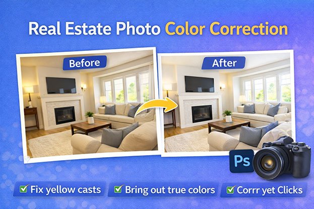
You photograph a bright, cream-colored living room. On screen, the walls look yellow, the windows glow blue, and the oak floor turns orange. It is one of the most common problems in property photography, and it is exactly what real estate photo color correction is meant to fix.
Color shapes how people read a room. Poor color balance can make a space look dull, too warm, too cold, darker than it really is, or simply unnatural. When every image in a listing shows accurate and consistent color, viewers can understand the property more clearly.
So where do these color problems come from, and how does careful editing solve them without misrepresenting the home? Let’s look at each piece.
What Is Real Estate Photo Color Correction?
Real estate photo color correction adjusts white balance, color casts, exposure, and related tones so a property image looks more natural and consistent with the actual scene.
Cameras do not see color the way people do. Our eyes adjust automatically to different light. A camera records what the light is actually doing, including unwanted tints.
Editors correct this by adjusting:
- White balance, so neutral surfaces look neutral
- Color casts, such as yellow, blue, or green tints
- Exposure and contrast, so the room is neither too dark nor washed out
- Saturation, so colors look real rather than faded or exaggerated
A simple example: A white wall shot under warm ceiling bulbs often looks yellow. Color correction reduces that yellow cast so the wall looks close to how it appears in person.
Correction is about accuracy. It is different from creatively changing an image’s mood, which is closer to color grading (covered below). In real estate, accuracy matters because buyers and renters judge walls, flooring, cabinets, countertops, furniture, and landscaping by what they see in the photos.
Why Real Estate Photos Need Color Correction
Most color problems are not caused by bad photography. They come from the conditions photographers work in every day.
Mixed Lighting
Many rooms combine daylight from windows with artificial light from lamps and fixtures. Daylight is cool (bluish). Most household bulbs are warm (yellowish or orange). The camera can only balance for one, so part of the room always looks off.
Incorrect White Balance
If the camera’s white balance setting does not match the light, the whole image shifts. Too warm, and the room looks orange. Too cool, and it looks cold and blue.
Indoor Lighting
Bulbs vary a lot. Tungsten and some LED bulbs push yellow or orange. Older fluorescent tubes can add a green tint. A single room may contain three or four different bulb types.
Weather and Outdoor Light
Exterior colors change with conditions. Overcast skies flatten color and add a cool tone. Open shade turns surfaces blue. Late afternoon sun warms everything. The same house can look different from morning to evening.
Camera Settings
Exposure, ISO, lens choice, and file format all influence color. RAW files keep far more color information than JPEGs, which gives editors more room to correct accurately.
Different Rooms
A south-facing kitchen, a windowless bathroom, and a basement office each have unique light. Without correction, they rarely match.
Post-Processing Differences
If images are edited one by one without a reference, or by different people, the same property can end up with several color styles in one gallery.
Common Color Problems in Real Estate Photos
Yellow or Orange Color Cast
Why do real estate photos look yellow? Usually because warm indoor bulbs dominate the scene or the camera’s white balance was set too warm. Editors cool the white balance and reduce yellow in neutral areas like ceilings and trim, while keeping wood tones natural.
Blue or Cool Color Cast
Why do property photos look blue? Daylight, open shade, overcast skies, and cool white balance settings all push images blue. It is common near windows and in exterior shots taken in shade. Editors warm the image slightly until whites look neutral again.
Green Color Cast
Some fluorescent lights produce a green tint. Green walls, lawns, or trees near windows can also bounce green light onto ceilings and floors. Editors correct this with the tint control and targeted color adjustments.
Dull and Flat Images
Flat images lack contrast and depth. They often come from overcast light, heavy haze, or low-contrast camera profiles. Controlled adjustments to contrast, clarity, and midtones can bring back depth without making the image harsh.
Oversaturated Colors
Pushing saturation too far makes grass neon, walls louder than they are, and wood look orange. It also makes a listing look edited rather than real.
Underexposed Images
Dark images hide details like flooring texture, cabinet finishes, and corners of the room. Careful brightening restores visibility without adding noise or grey shadows.
Overexposed Images
Too much brightness wipes out detail in windows, white cabinets, and light countertops. Editors recover highlights where the file allows it.
Inconsistent Colors
When one bedroom looks warm and the next looks cool, the gallery feels disconnected. Viewers may even wonder if the photos show the same property.
Why Accurate Color Matters in Property Photography
Photos are often the first detailed look someone gets at a property. People use them to judge:
- Walls and paint: Is it white, greige, or beige?
- Flooring and carpets: Oak, walnut, grey laminate?
- Cabinets and countertops: Is the marble white or cream?
- Furniture, curtains, and bedding: Do finishes look clean and fresh?
- Bathrooms: Do tiles and fixtures look clean?
- Landscaping and exterior surfaces: Is the lawn healthy? What color is the brick or siding?
If the photos show a yellow kitchen and the buyer later sees a white one, that mismatch creates doubt. The goal of correction is accurate presentation, not making a property look better than it is.
Color Correction vs Color Grading: What’s the Difference?
Color correction fixes technical problems so an image looks accurate. Color grading changes the look of an image for creative style or mood.
| Color Correction | Color Grading | |
|---|---|---|
| Purpose | Accuracy and natural appearance | Mood and visual style |
| Typical work | Fix white balance, remove casts, balance exposure, improve consistency | Warm or moody tones, cinematic looks, stylized palettes |
| Result | Looks like the real scene | Looks like an interpretation |
| Fit for real estate | Essential | Used sparingly, if at all |
Real estate photography generally prioritizes natural and accurate presentation. A light, consistent style is fine. Dramatic grading that changes how materials look is not.
White Balance and Real Estate Photography
White balance tells the camera or editor what “neutral white” looks like under a specific light, so every other color falls into place.
Light has a color temperature, measured in Kelvin:
- Warm light (around 2700K to 3200K): household bulbs, tungsten lamps
- Neutral daylight (around 5000K to 5600K): midday sun
- Cool light (6500K and above): shade, overcast skies
White and light grey surfaces make useful references. If a ceiling or door frame looks neutral, the rest of the image is usually close to right.
Auto white balance has limits. It guesses. In a room with cream walls or a large red rug, it may overcorrect. It can also choose a different setting for every frame, which creates inconsistency.
During post-production, editors sample a known neutral point, adjust temperature and tint, then check the result against materials like wood and stone. In mixed-light rooms, they may apply local corrections to specific areas instead of one global change.
How Mixed Lighting Creates Color Problems
A typical scenario: a living room gets daylight through large windows, while ceiling lights use warm bulbs.
The result:
- The area near the windows looks blue
- The area under the lights looks yellow
- One wall appears to be two different colors
- Furniture shows different tones depending on where it sits
A single white balance setting cannot fix both zones. Editors handle this with masks and local adjustments, warming the cool side and cooling the warm side until the room reads as one consistent space. Some warmth from lamps is usually kept, because a completely neutral lamp glow can look strange.
Photographers can reduce the problem on site by turning off mismatched lights or using flash, but editing still does most of the balancing work.
How Professional Real Estate Photo Color Correction Works
Here is a practical workflow used in professional real estate photo editing.
Step 1: Review the original image. Identify color casts, exposure problems, and uneven tones before touching anything.
Step 2: Check white balance. Decide whether the image leans warm or cool, and find a reliable neutral reference.
Step 3: Correct exposure. Set overall brightness so the room looks naturally lit without losing detail.
Step 4: Adjust highlights and shadows. Recover window and ceiling detail. Lift dark corners carefully.
Step 5: Correct color casts. Remove unwanted yellow, blue, green, or magenta shifts, globally or locally.
Step 6: Balance saturation. Keep colors true. Reduce anything that looks louder than real life.
Step 7: Refine individual colors. Fine-tune specific colors, such as an orange-leaning floor or a sky with a purple tint.
Step 8: Compare with the original. Toggle before and after. The corrected image should look like the real room, not a different one.
Step 9: Match the property set. Compare the image with the rest of the gallery and align temperature, brightness, and contrast.
Step 10: Final quality control. Review at full size and at typical listing size before delivery.
Before and After: What Good Color Correction Should Look Like
Before correction, you often see:
- Yellow or blue casts
- A dull, flat appearance
- Inconsistent colors between rooms
- Dark, muddy shadows
- Bright, clipped highlights
After correction, you should see:
- Natural white balance
- Balanced, believable colors
- Consistent tones across the gallery
- Visible detail in shadows and highlights
- Realistic saturation
The “after” image should still represent the real property. If the edit looks impressive but no longer matches the home, it has gone too far.
Color Correction for Different Types of Real Estate Photos
Interior Photos
Living rooms, bedrooms, kitchens, bathrooms, and offices usually have the most mixed lighting. Priorities are neutral walls and ceilings, accurate wood and stone, and clean bathroom whites.
Exterior Photos
For homes, buildings, driveways, and gardens, the focus is on natural sky tones, realistic grass, and accurate siding, brick, and roof colors. Shaded facades often need warming.
Luxury Property Photos
High-end finishes such as marble, brass, and specialty woods need subtle, controlled edits. Buyers at this level look closely, so restraint matters more than impact.
Commercial Property Photos
Offices, restaurants, retail spaces, and hotels often mix fluorescent, LED, and daylight. Consistent correction helps these spaces look clean and professional.
Vacation Rental Photos
Guests browse many listings quickly. Consistent color across every room creates a cohesive gallery and sets honest expectations for the stay.
Twilight and Evening Photos
Dusk images are intentionally warm inside and blue outside. Here, correction does not mean neutralizing everything. It means keeping the mood while ensuring interior lights do not look orange and the sky looks believable.
Color Correction and HDR Real Estate Photography
HDR photography combines several exposures to capture a wider dynamic range, so both bright windows and dark interiors keep detail. Exposure blending does something similar, often with more manual control.
HDR does not automatically produce natural colors. Common HDR problems include:
- Excessive saturation
- Unnatural, flat, or crunchy contrast
- Halos around windows and edges
- Odd color tones, especially grey or muddy walls
- Interiors that look brighter than daylight
Careful post-production fixes these issues by correcting white balance after the merge, controlling saturation, cleaning halos, and balancing window views so they look like a real view through glass. The best HDR edits do not look like HDR at all.
How to Keep an Entire Property Listing Consistent
Every photo in a gallery should share a similar:
- Color temperature
- Brightness
- Contrast
- Saturation
- White balance
- Overall editing style
When images vary, the gallery feels like it was pulled from different shoots. Consistency helps viewers move from room to room without distraction.
Consistency checklist:
- Choose one “hero” image as the reference for the set
- Keep whites and ceilings equally neutral across rooms
- Match exposure so no room looks unusually dark or bright
- Use the same saturation level throughout
- Review all images side by side before delivery
- Keep exteriors consistent with each other, even if shot at different times
Common Real Estate Color Correction Mistakes
- Excessive saturation that makes everything look artificial
- Unnaturally green grass that looks painted
- Skies that are too blue or turn purple
- Over-warming interiors until they look orange
- Over-cooling rooms until they feel sterile
- Crushing shadows so dark areas lose detail
- Blowing out highlights in windows and white surfaces
- Changing actual property colors, such as shifting a beige wall to white
- Inconsistent editing across the gallery
- Overusing HDR effects
- Correcting without checking the original
Professional editors avoid these by working from neutral references, comparing with the original, and reviewing the full set together rather than one image at a time.
Does Color Correction Change the Actual Property?
Color correction should improve the photograph without misleading the viewer about the property itself.
Appropriate correction includes:
- Removing color casts caused by lighting
- Restoring natural tones
- Balancing white balance
- Improving exposure
- Keeping property colors accurate
What should not be done:
- Changing the actual paint color
- Making grass unrealistically vibrant
- Altering permanent property features
- Making materials look completely different
- Creating a false impression of the property
Listing rules and local regulations may also limit how far edits can go. When in doubt, ask one question: will the visitor recognize this room when they walk in?
DIY vs Professional Real Estate Photo Color Correction
DIY Editing
Tools like Adobe Lightroom, Photoshop, and Camera RAW give you full control. Presets and batch sync can speed things up.
The challenges:
- A real learning curve, especially for mixed lighting
- Manual masking and local adjustments take time
- Consistency is hard across large shoots
- Editing competes with shooting and client work
DIY works well for low volumes, simple lighting, or photographers who enjoy editing and have built a reliable process.
Professional Editing
Outsourcing to a professional real estate photo editing team offers:
- Experienced editors familiar with real estate lighting problems
- Consistent workflows and style guides
- Batch processing for large collections
- Color matching across entire properties
- Quality control before delivery
Professional editing is not always required. It often makes sense when volume grows, turnaround matters, or consistency across many listings becomes difficult to maintain alone.
AI-Assisted Real Estate Color Correction in 2026
AI tools now help with automatic white balance, color correction, batch processing, automatic masking of skies and windows, exposure balancing, and general image enhancement. For clean, simple rooms, results can be quite good.
AI still struggles with:
- Unusual or mixed lighting
- Complex interiors with many materials
- Reflective surfaces like glass, mirrors, and polished stone
- Unusual wall colors that it mistakes for casts
- Inconsistent original files
There is an important difference between AI-assisted editing and fully automated editing. AI-assisted editing uses tools to speed up the work while a person checks and refines the result. Fully automated editing sends files through software with no human review.
When accuracy matters, human review remains important. AI can support a good workflow, but it should not be treated as perfect.
How Much Does Real Estate Photo Color Correction Cost?
Pricing depends on several factors:
- Number of images
- Image complexity
- Amount of correction needed
- Exposure problems
- Mixed lighting
- HDR merging or blending
- Additional retouching (object removal, sky replacement)
- Turnaround time
- Bulk volume
- Quality-control requirements
Common pricing structures:
- Per image: most common for regular orders
- Per project: for a full property shoot
- Bulk packages: discounted rates for larger volumes
- Monthly arrangements: for photographers and agencies with steady workloads
Actual pricing varies by provider, image complexity, volume, turnaround, and required services. The most reliable way to compare is to request a quote based on your real files.
How to Choose a Real Estate Photo Editing Company
Evaluate these points before committing:
- Real estate experience: Do they specialize in property images?
- Color correction quality: Do their results look natural?
- Before-and-after samples: Are they realistic and relevant to your work?
- Consistency: Do full galleries match, not just single images?
- Communication: Are they easy to reach and clear about instructions?
- Turnaround: Can they meet your listing deadlines?
- Revisions: Is there a clear revision policy?
- File formats: Do they accept RAW and bracketed files?
- Delivery method: Is delivery simple and reliable?
- Quality control: Is every image reviewed before delivery?
- Bulk capability: Can they handle busy periods?
- Privacy and file handling: How are your images stored and protected?
- Sample editing: Can you test them first?
Start by sending a small batch. It shows you their quality, communication, and consistency before you order a larger project.
Real Estate Photo Color Correction With Clipping Area
Clipping Area is a Post-Production Photo Retouching Agency. We support real estate photographers, agents, agencies, property marketers, and rental businesses with editing that keeps property images natural and consistent.
Our real estate work includes:
- Real Estate Photo Editing
- Real Estate Photo Color Correction
- HDR Real Estate Photo Editing
- Exposure Correction
- White Balance Correction
- Perspective Correction
- Sky Replacement
- Window View Enhancement
- Object Removal
- Property Photo Retouching
- Image Enhancement
- Bulk Real Estate Image Editing
Every edit follows the same principle described in this article: fix the lighting, keep the property honest.
If you want to see how your own images could look, send a small batch of property photos for review.
[Get a Free Sample] · [Get a Free Quote]
Real Estate Photo Color Correction Checklist
Save this list and run through it before publishing any gallery:
- Is the white balance natural?
- Are whites actually neutral?
- Are warm areas controlled?
- Are cool areas controlled?
- If people appear, do skin tones look natural?
- Do walls and flooring look realistic?
- Is saturation controlled?
- Are highlights preserved?
- Do shadows keep detail?
- Does the image look natural overall?
- Does it match the rest of the property gallery?
- Has the original property appearance been preserved?
- Has the image been checked before delivery?
Frequently Asked Questions
1. What is real estate photo color correction?
Real estate photo color correction is the process of adjusting white balance, color casts, exposure, contrast, and saturation so property photos look natural and accurate. It removes unwanted tints caused by lighting and camera settings, helping walls, floors, furniture, and exteriors appear close to how they look in person.
2. Why do real estate photos look yellow?
Real estate photos usually look yellow because warm indoor bulbs, such as tungsten or warm LED lights, dominate the scene. A camera white balance set too warm can also cause it. Editors fix this by cooling the white balance and reducing yellow in neutral surfaces like ceilings, trim, and white walls.
3. Why do property photos look blue?
Property photos look blue when daylight, open shade, or overcast skies dominate, or when the camera’s white balance is set too cool. It often appears near windows and in shaded exterior shots. Warming the white balance until whites look neutral usually restores a natural appearance.
4. How do you fix color casts in real estate photos?
Start by finding a neutral reference, such as a white ceiling or door frame, and set white balance from it. Then adjust temperature and tint. For mixed lighting, use local masks to correct warm and cool areas separately. Finally, compare with the original to confirm the colors still look realistic.
5. What is the difference between color correction and color grading?
Color correction fixes technical issues like white balance, color casts, and exposure so the image looks accurate. Color grading changes the image’s mood or style for creative effect. Real estate photography focuses mainly on correction, because buyers and renters need an accurate view of the property.
6. How do you correct white balance in property photos?
Shoot in RAW if possible, then use the white balance picker on a neutral surface in your editor. Fine-tune temperature and tint by eye, checking wood and stone tones. Apply the same base setting to similar rooms, then adjust each image slightly so the whole gallery stays consistent.
7. Can color correction fix dull real estate photos?
Yes, in most cases. Dull photos usually lack contrast, have muted color, or suffer from a slight cast. Balancing exposure, adding controlled contrast, correcting white balance, and gently restoring saturation can bring back depth. The aim is a clear, natural image, not an exaggerated one.
8. Does HDR automatically improve real estate photo colors?
No. HDR expands dynamic range so windows and interiors both keep detail, but it does not guarantee accurate color. HDR merges can introduce oversaturation, halos, grey walls, and odd tones. Color correction after the merge is usually needed to make the result look natural.
9. Should real estate photos have highly saturated colors?
No. Heavy saturation makes grass, skies, walls, and wood look unrealistic and can mislead viewers. Real estate photos should have natural, controlled saturation. Colors should look clean and clear while still matching what someone sees when they visit the property.
10. How much does real estate photo color correction cost?
Cost depends on image count, complexity, lighting problems, HDR needs, extra retouching, turnaround time, and volume. Providers commonly charge per image, per project, through bulk packages, or monthly arrangements. Prices vary widely, so the best approach is requesting a quote based on your actual files.
11. Can professional editors color-correct large batches of property photos?
Yes. Professional editing teams use batch workflows, reference images, and style guides to correct large volumes while keeping colors consistent. Quality control still matters, since each room may need individual adjustments. Sending a small test batch first helps confirm the provider can maintain quality at scale.
12. How do I choose a real estate photo editing service?
Look for real estate experience, natural before-and-after samples, consistent galleries, clear communication, reliable turnaround, a revision policy, and secure file handling. Confirm they accept your file formats and can handle your volume. Test them with a small batch before placing a larger order.
Conclusion
Color correction matters because cameras record light as it really is, casts and all. Mixed lighting, white balance errors, weather, and inconsistent editing can make even a well-shot property look dull, yellow, blue, or unbalanced.
Good correction brings images back to natural, accurate, and consistent color. It helps viewers understand walls, floors, finishes, and spaces as they truly are, without exaggerating anything.
Whether you edit your own files or work with a professional team, the standard stays the same: the photos should look like the property. If you want a second pair of expert eyes, send a small batch and see the difference for yourself.