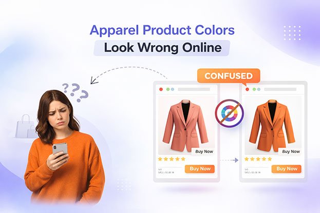
You hold a sweater in your hand. It is a warm burgundy, rich and deep. Then you open the product page and see something closer to brick red, or maybe a flat purple. Your customer sees a third version on their phone. A few weeks later, the returns start coming in with the same comment: “Color not as pictured.”
If this sounds familiar, you are not alone. Color mismatch is one of the most common and frustrating problems in fashion ecommerce. For clothing brands, apparel manufacturers, Shopify store owners, and Amazon sellers, it directly affects conversion rates, return rates, and customer trust.
The good news is that the problem is not a mystery. Color changes happen at specific, predictable stages between the real garment and the customer’s screen. Once you understand where color goes wrong, you can control most of those stages and dramatically improve how accurately your apparel product colors appear online.
This guide walks through the full journey of a product color, explains what goes wrong at each step, and shows how professional photography, color correction, and retouching solve the problem.
The Short Answer
Clothing colors look different online because color passes through many stages before a customer sees it: the fabric itself, the lighting, the camera, the editing software, the color profile, the ecommerce platform, and finally the customer’s screen. Each stage can shift the color slightly. Small shifts at several stages add up to a product that looks noticeably wrong.
Professional color correction cannot make every screen in the world display the exact same color, because customer devices vary. What it can do is make your images as accurate as possible at the source, match them to the physical product, and prepare them in a standard format that most screens display reliably. That is the part you control, and it makes a big difference.
The Journey of a Color: From Garment to Customer
To fix color problems, it helps to think of color as traveling through a chain:
Real clothing → Photography lighting → Camera → Editing → Color profile → Ecommerce website → Customer screen
A weak link anywhere in this chain can distort the final result. Many brands assume the editor “got the color wrong,” but the issue often started long before editing, or happened after the image was uploaded. Let’s look at each stage.
Stage 1: The Fabric Itself
Before a camera is even involved, the garment already presents challenges.
Different fabrics reflect light differently
Cotton, silk, satin, velvet, denim, wool, and polyester all interact with light in their own ways. Satin and silk have a sheen that creates bright highlights and deep shadows, so a single garment can show several apparent shades at once. Velvet absorbs light in one direction and reflects it in another, which makes it look darker or lighter depending on the angle. Knitted textures create tiny shadows that make colors appear deeper than a smooth fabric of the same dye.
Metamerism: when colors change under different light
Some dyes look like one color under daylight and another under indoor lighting. This effect is called metamerism. Two fabrics that match perfectly in a showroom can look mismatched under studio strobes or warm household bulbs. This is why a customer may see a navy jacket as black in their living room, and why your photo may not match what you see in the warehouse.
Optical brighteners and fluorescent dyes
Many white and bright garments contain optical brightening agents that react to ultraviolet light. Under some lights they glow slightly blue. Neon and fluorescent colors are even harder, because they are more vivid than most screens can reproduce. These colors almost always need careful correction after the shoot.
Difficult colors
Certain colors are notoriously hard to capture accurately:
- Deep blues and navy, which often shift toward purple or black.
- Reds and burgundy, which easily oversaturate or turn orange.
- Greens and teals, which can drift toward blue or yellow.
- Pure whites and blacks, which lose texture and detail when exposure is slightly off.
- Pastels, which can wash out or pick up color casts easily.
Knowing that your product falls into one of these groups tells you to take extra care at every later stage.
Stage 2: Lighting Changes Everything
Lighting is the single biggest factor in how apparel colors appear in photographs. A camera does not see “the color of the shirt.” It sees light reflected off the shirt. Change the light, and you change the color.
Color temperature
Every light source has a color temperature, measured in Kelvin (K). Candlelight and household bulbs are warm (orange-yellow, around 2,700K to 3,200K). Midday daylight is more neutral (around 5,500K). Shade and overcast sky are cool and bluish (6,500K and above). A white T-shirt photographed under warm bulbs looks cream. The same shirt photographed in shade looks slightly blue.
Mixed lighting
One of the most common mistakes in small studios and home setups is mixing light sources, such as window light plus ceiling lights. The result is a garment with warm tones on one side and cool tones on the other. This cannot be fixed with a single global adjustment, which makes editing slower and less accurate.
Reflected color from the environment
Colored walls, floors, and nearby objects bounce colored light onto the product. A green wall can add a green tint to a white dress. Professional studios use neutral backgrounds and controlled light modifiers for this reason.
Light quality and direction
Harsh, direct light creates hotspots where color disappears into white highlights and deep shadows where color disappears into black. Soft, even light shows the true color across more of the garment’s surface.
The fix: Use consistent, high-quality studio lighting with a known color temperature, avoid mixing light sources, and shoot against neutral surroundings. Consistent lighting across every shoot is the foundation of consistent product colors.
Stage 3: How Camera Settings Affect Color
Even with perfect lighting, the camera makes its own decisions about color unless you control them.
White balance
White balance tells the camera what “neutral white” looks like under the current light. If it is set incorrectly, the whole image shifts toward blue, orange, green, or magenta. Auto white balance is especially risky for apparel because the camera tries to guess based on what is in the frame. A large red dress can confuse auto white balance into making the whole scene cooler, which changes the red itself.
The professional approach is to set a custom white balance using a gray card or a white balance target at the start of each lighting setup, then keep it locked.
Exposure
Exposure affects color more than most people realize. Overexposed images make colors look lighter and less saturated, and light fabrics lose texture. Underexposed images make colors darker and muddier, and shadows can pick up noise that adds false color. A navy shirt that is slightly underexposed can look black. A pale pink blouse that is overexposed can look white.
Camera picture styles
Most cameras apply picture profiles like “Vivid,” “Portrait,” or “Standard” to JPEG files. These boost contrast and saturation in ways that make images look attractive but inaccurate. For product photography, a neutral or faithful profile is the safer choice.
RAW vs JPEG
Shooting in RAW format keeps all the color data the sensor captured, which gives editors far more room to correct white balance and exposure without damaging the image. JPEG files are already processed and compressed inside the camera, so corrections are more limited and can cause banding or color shifts.
Color reference targets
Professional product photographers often photograph a color checker chart at the beginning of each setup. This gives the editor a known reference to calibrate against, which makes color correction far more precise and repeatable across a large catalog.
The fix: Shoot RAW, set custom white balance with a gray card, expose carefully, use a neutral picture profile, and include a color reference target when accuracy matters.
Stage 4: Editing Can Help or Hurt
Editing is where color is either rescued or ruined.
Uncalibrated monitors
If the person editing your images uses an uncalibrated monitor, they are making decisions based on inaccurate information. A monitor that displays colors too blue will lead the editor to warm up every image, and the final result will look too warm on accurate screens. Professional retouchers work on calibrated monitors, commonly set to a D65 white point and a standard gamma, and calibrate them regularly because displays drift over time.
Over-editing for “pop”
Many brands and freelancers boost saturation, contrast, or clarity to make products look more exciting. This may help thumbnails stand out, but it often makes the product look more vivid than it really is, which leads to disappointed customers and returns.
Filters and presets
Lifestyle presets and Instagram-style filters are designed for mood, not accuracy. They are fine for campaign imagery but should not be used on product detail images where customers judge the true color.
Inconsistent editing across batches
When multiple editors work on the same catalog without shared standards, the same product can appear in slightly different shades across front, back, detail, and on-model images. Customers notice this, and it reduces trust.
Stage 5: Color Profiles Explained Simply
A color profile is a set of instructions that tells software and screens how to interpret the color numbers in an image file. The same numbers can look different depending on which profile is attached.
The most common profiles are:
- sRGB: the standard color space for the web. Most browsers, phones, and consumer monitors are designed around it.
- Adobe RGB: a wider color space often used in photography and print workflows. It can show more saturated colors, but only on screens and software that support it.
- ProPhoto RGB: an even wider color space used for high-end editing. It is not suitable for web delivery.
- CMYK: a color model for printing, not for screens.
Why RGB and sRGB matter for ecommerce images
Screens create color by mixing red, green, and blue light, which is why web images use RGB. Within RGB, sRGB is the safest choice for ecommerce because it is the common standard that browsers and most devices expect.
Problems happen when images are delivered in the wrong profile. An image saved in Adobe RGB and uploaded to a website may look dull and desaturated on devices or browsers that do not handle the profile correctly. An image saved in CMYK may display with strange, shifted colors or be rejected by some platforms. An image with no embedded profile leaves the browser guessing.
The fix: Edit in a suitable working space, then convert (not just assign) final ecommerce images to sRGB and embed the profile when exporting. This is one of the simplest and most effective steps for improving color consistency online.
Stage 6: What Happens After You Upload
Even a perfectly prepared image can change once it reaches your ecommerce platform.
Compression
Shopify, Amazon, WooCommerce, and other platforms often compress and resize images for faster loading. Heavy compression can create color banding in gradients, blotchy shadows, and slight shifts in subtle tones like pastels and skin.
Format conversion
Many platforms and content delivery networks automatically convert images to formats like WebP or AVIF. Most conversions are fine, but some processes can strip embedded color profiles, which can affect how colors are interpreted.
Marketplace requirements
Marketplaces such as Amazon have their own image requirements for background color, dimensions, and file types. Images that do not meet these standards may be processed or rejected, and repeated re-exports to fix issues can introduce more color drift.
The fix: Upload high-quality exports at the recommended dimensions, use sRGB, avoid saving the same JPEG repeatedly, and check how your images actually look on the live product page after upload, not just in your editing software.
Stage 7: Why Different Screens Show Colors Differently
This is the stage you cannot fully control, and it is important to be honest about it.
Customers view your products on a huge range of devices: budget laptops, high-end phones, older tablets, office monitors, and televisions. These screens differ in:
- Brightness and contrast. A dim screen makes colors look darker.
- Color gamut. Some screens show a wider range of colors than others.
- Panel technology. OLED and LCD screens render blacks and saturated colors differently.
- Factory calibration. Many consumer screens are tuned to look vivid rather than accurate.
- User settings. Night mode, blue light filters, and adaptive color features like True Tone warm up or shift the entire display.
- Viewing environment. Room lighting and viewing angle change how colors are perceived.
No photo editor can make every screen display exactly the same color. What professional preparation does is make sure your image is accurate at the source and delivered in the standard format that most devices are built to display. That gives the widest possible group of customers the most accurate view, and it removes the errors that are under your control, so the only remaining variation is the customer’s own device.
How Professional Color Correction Works
Professional apparel color correction is a structured process, not a quick slider adjustment. A typical workflow looks like this:
- Evaluate the source images. The retoucher checks exposure, white balance, lighting consistency, and whether a color reference or physical sample is available.
- Neutralize color casts. Using gray references, neutral areas of the scene, or a color checker, the editor removes unwanted blue, yellow, green, or magenta casts.
- Correct exposure and tonal range. Highlights and shadows are adjusted so the fabric shows texture and true color without clipping to pure white or black.
- Match to the physical product or reference. When a brand provides a physical sample, a Pantone reference, or an approved “hero” image, the editor matches the product color to that reference under controlled viewing conditions.
- Use selective adjustments. Instead of changing the whole image, the retoucher uses masks to adjust only the garment, so the background, model’s skin, and props stay natural.
- Check consistency across views. Front, back, side, detail, flat lay, ghost mannequin, and on-model images of the same product are compared side by side so the color matches throughout.
- Prepare for web delivery. The final images are converted to sRGB, sized correctly, and exported with appropriate compression for the target platform.
Color matching for multiple variants
When a single style comes in several colors, many brands shoot one colorway and create the others through color change editing. This saves shoot time and cost, but it must be done carefully. Each variant should be matched to its real fabric reference, with correct shading, texture, and highlights, so the digitally changed colors look as real as the photographed ones.
How Professional Retouching Supports Color Accuracy
Color correction works best alongside other apparel retouching tasks:
- Background removal and clipping path create clean, neutral backgrounds that do not reflect color onto the garment and make color judgment easier for customers.
- Ghost mannequin editing presents garments consistently, so color and shape are shown without distraction.
- Dust, lint, and wrinkle removal keep attention on the product rather than on flaws that can alter perceived color and texture.
- Shadow creation adds realism without introducing colored shading.
- Consistent cropping and alignment make catalog pages look uniform, so small color differences between products are real and meaningful rather than caused by presentation.
A Practical Checklist for Consistent Apparel Colors
Use this checklist to improve color accuracy across your catalog:
- Shoot with consistent, controlled studio lighting at a known color temperature.
- Avoid mixed light sources and colored surroundings.
- Shoot in RAW format with a neutral picture profile.
- Set a custom white balance with a gray card for each setup.
- Include a color checker or reference target at the start of each shoot.
- Keep a physical sample or approved color reference for each product.
- Edit on a calibrated monitor, or work with an editor who does.
- Avoid heavy saturation boosts and creative filters on product detail images.
- Convert final web images to sRGB and embed the profile.
- Export at platform-recommended sizes and avoid repeated JPEG re-saves.
- Review images on the live store across several devices, including phones.
- Document your standards so every photographer and editor follows the same process.
When Should You Outsource Apparel Photo Editing?
Many brands start by editing images in-house. That can work for a small catalog, but outsourcing becomes the smarter choice when:
- Returns mention color mismatch. If customers regularly report that products look different in person, your current workflow is costing money.
- Your catalog is growing quickly. Seasonal launches, new colorways, and marketplace expansion create volumes that are hard to handle internally.
- Colors are inconsistent across your store. If the same product looks different across images or channels, you need standardized editing.
- Your team lacks calibrated equipment or specialist skills. Accurate color correction requires both the right tools and trained eyes.
- You sell on several platforms. Shopify, Amazon, and other marketplaces each have requirements, and a specialist team can prepare images for all of them.
- You need faster turnaround. A dedicated editing team can process large batches while your team focuses on product, marketing, and sales.
- You work with difficult fabrics or colors. Satin, velvet, neon, deep navy, and true black benefit from experienced retouchers.
How Clipping Area Can Help
Clipping Area is a professional post-production photo retouching agency that has worked with clothing brands, fashion retailers, ecommerce businesses, and photographers since 2014. Our team focuses on making apparel images accurate, consistent, and ready to sell.
Our apparel and ecommerce editing services include:
- Color correction and color matching to your physical samples or brand references.
- Color change editing for multiple product variants.
- Ghost mannequin editing for clean, consistent apparel presentation.
- Clipping path and background removal for marketplace-ready images.
- Photo retouching for dust, lint, wrinkles, and fabric flaws.
- Ecommerce image preparation with correct sizing, sRGB conversion, and platform-ready exports for Shopify, Amazon, and other stores.
We follow clear color standards across every batch, so your front, back, detail, and on-model images match, and your catalog looks consistent from one collection to the next.
If your product colors do not match what customers receive, send us a few sample images along with your reference photos or color details. We will show you how accurate, consistent color can look across your store.
Frequently Asked Questions
Why does my clothing look a different color in photos than in real life?
Usually because of lighting, incorrect white balance, exposure errors, or camera color settings. Editing, color profiles, platform compression, and screen differences can add further changes.
Can photo editing make my product color look exactly the same on every screen?
No. Customer screens vary in brightness, calibration, and settings. Professional editing makes your images accurate at the source and prepares them in the web standard format, which gives the most reliable result across most devices.
What color profile should I use for ecommerce product images?
sRGB is the safest choice for websites and online marketplaces because it is the standard most browsers and devices are built around.
Is shooting in RAW necessary for apparel photography?
It is strongly recommended. RAW files keep more color information, which allows more accurate white balance and exposure correction.
How can I reduce returns caused by color mismatch?
Use controlled lighting, set a custom white balance, shoot RAW, match images to physical samples, avoid over-editing, export in sRGB, and check images on the live site across several devices.
Can one photo be used to create different color variants?
Yes. Professional color change editing can create realistic variants from one photograph, as long as each color is matched to its real fabric reference.
Conclusion
When apparel product colors look wrong online, the cause is rarely a single mistake. Color travels from the fabric through lighting, camera settings, editing, color profiles, ecommerce platforms, and finally the customer’s screen. Every stage can introduce a small shift, and those shifts add up.
You cannot control every customer’s device, but you can control nearly everything before it. Consistent lighting, correct camera settings, calibrated editing, careful color matching, and proper sRGB web preparation make your images as accurate and consistent as possible. That leads to more confident buyers, fewer returns, and a stronger brand.
If you want your product photos to show customers the colors they will actually receive, professional apparel color correction is one of the most valuable investments your store can make. Clipping Area is ready to help.